Palazzo Caprini
(House of Raphael)
Rome, c. 1510
Architect: Bramante
HISTORY
Commission
Bramante built the Palazzo Caprini in Rome for the Caprini family around 1510.
Ownership by Raphael
Raphael purchased the palace in 1517, which has given rise to its alternate name, the "House of Raphael."
Destruction
The palace was destroyed in the seventeenth century, and now it is known only through drawings.
GENERAL DESIGN
Description
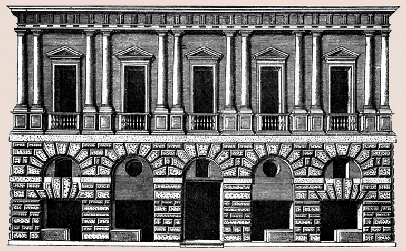
Like most of Bramante's buildings, the Palazzo Caprini was simple in its conception and harmonious in its proportions. In being five-bays wide and two-stories high, its silhouette was horizontal.
Symmetry and Repetition
The bays of the piano nobile were alike, but the bays of the ground story were slightly varied in the placement and shapes of the openings, the two on the left being a mirror image of the two on the right.
Ornament Used to Articulate Structure
Although the classical trim and textured masonry surface are ornamental rather than structural, they were designed to accentuate the architectural parts that are structurally important.
The rough texture of the rustication expressed the ground story's strength and load-bearing capacity.
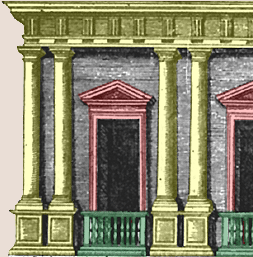
In appearing to support the entablature, the half-column pairs implied the presence of a supportive structure between the windows.
The building's two main horizontal features, the entablature and the string course, emphasized two major structural parts, the edge of the roof and the floor of the piano nobile.
The pedimented frames and sections of balustrade accentuated the windows of the piano nobile.
TWO-STORY TREATMENT
Articulation of Four Stories as Two
Although the Palazzo Caprini was articulated as two stories--a rusticated ground story and a column-ornamented piano nobile, it actually had four stories. The windows of a mezzanine were located in the upper arches of the ground story, and the windows of an attic were concealed in the entablature.
Contrast between Stories
The palace's main stories presented a strong contrast to each other in materials, vocabulary, and textures.
Visually, the piano nobile, which displayed a variety of refined features, was the dominant story, and the ground story, which had a uniform texture and pattern, functioned as a pedestal for displaying the it.
An earlier palace that also exploited contrasting levels of refinement between the ground story and piano nobile is the Palazzo Pazzi, whose façade differed from that of the Palazzo Caprini in having a third story and a rougher form of rustication that was executed using real stone.
Ornateness Paralleling Class
The refinement of the piano nobile paralleled the refinement of the patrons who occupied that story, and the relative coarseness of the rough masonry of the ground story paralleled the lack of refinement of the tradesmen and household servants who used it.
COLUMN USAGE
Usage of Doric Form on Piano Nobile
Bramante's use of the Doric order on only the piano nobile was new because this order was usually used on the ground story in a scheme of superimposed orders, which can be seen at the Colosseum and the Palazzo Rucellai as well as his own Belvedere Court.
The combination of a ground story without the orders (except at the portals) with a piano nobile ornamented by the orders had been used earlier at the Palazzo della Cancelleria, which differed from the Palazzo Caprini in having pilasters instead of engaged columns.
Usage of Engaged Form
Instead of using flat pilasters, like those used by Alberti on the Palazzo Rucellai, Bramante used engaged columns, which increased the façade's plasticity and made the columns look like a screen in front of the wall instead of part of the wall pattern.
In using engaged columns rather than pilasters, the Palazzo Caprini was preceded by two loggias begun in the 1460s, the Benediction Loggia and the courtyard of the Palazzo Venezia. The placement of the engaged columns against piers at these sites differed from their placement at the Palazzo Caprini, where they stood against a wall.
Usage in Pairs
Instead of using a simple alternation of single columns with windows, the columns between windows of the Palazzo Caprini are used in pairs, a pattern also seen on the earlier Palazzo della Cancelleria.
RUSTICATION
Expression of Strength
The appearance of strength and massiveness created by the large-block, rough-textured masonry on the ground story expressed its function as a supporting story for the piano nobile.
Simulation of Stone Using Plaster
The appearance of rusticated stonework was created by covering the ground story's structural core of brick with a mixture of stucco and crushed marble that was modeled on the surface to give it the texture of stone.
This produced the same effects of texture and strength as cut stone but at far less cost. Real stone was only used for moldings and for the capitals and bases of columns.
Square-Cut Voussoirs
The outer edges of the voussoirs were squared instead of curved like those of Florentine arches. Square-cut voussoirs, which had been used in ancient times by the Romans, were used at the end of the fifteenth century by Giuliano da Sangallo at the Palazzo Gondi.
Masonry Pattern
Bramante designed the simulated stonework to resemble large stones laid in a precise pattern that was repeated from bay to bay above the ground-story windows. The repetition of the stone pattern from bay to bay had been used in the late-fifteenth century on the Palazzo Gondi.
CAPRINI-INFLUENCED PALACES
Dissemination of Influence
The Palazzo Caprini's influence is reflected by numerous sixteenth-century palaces, many of which were designed by followers of Bramante who had worked in Rome until the 1520s and then moved to other parts of Italy.
♦Palazzo Vidoni-Caffarelli (architect unknown), Rome. The Palazzo Vidoni-Caffarelli (Rome, c. 1515-20), whose architect is unknown but seems to have been a follower of Raphael, resembles the Palazzo Caprini in having large-scale rustication on the ground story, pairs of engaged columns on pedestals between the windows of the second story, and only two stories (originally).
♦Giulio Romano's Palazzo Stati Maccarani, Rome, c. 1522-23. The Palazzo Stati Maccarani, now called the Palazzo di Brazzà, resembles Bramante's Palazzo Caprini in a number of basic features. The ground story is similar in being rusticated and using large-scale, precisely shaped blocks of simulated stone but different in using a series of flat arches instead of an arcade of round arches. Giulio's doorway also differs in being taller than the side arches. The piano nobile, which was executed in stucco, is similar to that of the Palazzo Caprini in using story-high orders and pediment-topped windows. It is but different in using shallow pilasters instead of half-round columns. It also differs in alternating triangular and segmental pediments, a feature that Raphael revived from antiquity. Despite these similarities, the Palazzo Stati Maccarani differs from the Palazzo Caprini in very important ways. The emphasis resides on the lower story, where stacks of blocks frame a doorway and oversized voussoirs create an appearance of force and movement. This dynamic handling of masonry became part of Giulio's lifelong vocabulary of architectural elements.
♦Sanmicheli's Palazzo Pompei, Verona. Sanmicheli's Palazzo Pompei (Verona, begun 1532) resembles the Palazzo Caprini in having a simple, two-story composition consisting of a rusticated ground story below a piano nobile ornamented by engaged Doric columns carrying an entablature, classically inspired trim around the windows, and balustrades below the windows. The differences between the two palaces include using single columns between the windows, varying the bay widths, and not dividing the outer ground-story with flat arches.
♦Sansovino's Zecca, Venice. Jacopo Sansovino's La Zecca (Venice, 1536-45), the Mint, was originally only two-stories high, and in this and several other features, it resembles Bramante's design for the Palazzo Caprini. La Zecca differs from it in using single columns that have banded rustication whose aggressive texture is unlike the refined smooth textures of the Palazzo Caprini.
♦Sansovino's Palazzo Corner della Ca' Grande, Venice. Sansovino's Palazzo Corner della Ca' Grande (Venice, begun c. 1545) includes a number of features that had been introduced in Rome by Bramante and other architects while retaining elements of the traditional Venetian three-part composition. Although the three parts are quite distinct on the ground story, the differentiation between the central and outer bays on the upper stories is more subtle than on earlier Venetian palaces. The windows of the outer bays are narrower than those of the center, and the extra space takes the form of small strips of wall located between the column pairs and the windows. The distinctions between the inner and outer bays are minimized by the use of pairs of columns, which add a visually strong element of regularity.
♦Palladio's Palazzo Porto, Vicenza. The Palazzo Porto (Vicenza, c.1552) by Palladio, who made a drawing of the Palazzo Caprini while on one of his visits to Rome, is similar to it in several ways. Both have large-stone rustication and flat arches on the ground story and engaged columns on the piano nobile. The Palazzo Porto is different in having single half-columns without bases between windows, free-standing figures on the entablature's ressauts, stucco ornamentation around the corner and central windows, and masks above the ground-story windows.
♦Zanobi Folfi's Palazzo Uguccioni, Florence. Although the Palazzo Uguccioni (Florence, 1550s) has three stories and totally different height-to-width proportions from those of the Palazzo Caprini, it is similar to it in having large-stone, rusticated masonry on the ground story and pairs of engaged columns between pedimented windows on smooth-finished wall surfaces above it.
See visual summary by clicking the Views button below.


 Add Placemark
 Go Back


