16th-Century Palaces in Central Italy
DESIGN OF ROMAN PALACES
Rome as the New Center of the Arts
At the beginning of the sixteenth century, Rome came to the fore as the center of the arts in Italy because Pope Julius II, Pope Leo X, and Pope Clement VII allocated huge sums to building and decorating projects and called the leading Italian painters, sculptors, and architects to Rome.
Changes to Façade's Ground Story
Several changes to the function and appearance of the ground story of Roman palaces took place in the early sixteenth century.
●Decline of arcade. The practice of renting ground-story rooms to shopkeepers began to decline in the early sixteenth century. Because storefronts were usually enclosed within vaulted openings, not renting out this space meant that palaces no longer needed to have arcaded ground stories.
●Decline of mezzanine. The necessity of a mezzanine, which served for storage or shopkeepers' quarters, declined along with the commercial use of the ground story. This made it possible to make the vestibule as tall as the courtyard loggia, so that the two intersecting corridors could be neatly joined.
Changes to the Courtyard
At the beginning of the sixteenth century, only the grandest of Roman courtyards such as those of cardinals' palaces like the Cancelleria had loggias on all four sides, a feature that was typical of Florentine courtyards.
In Roman palaces, it was more common for there to be a single loggia between the vestibule and the courtyard. When space permitted, a second loggia might be located opposite the first, as seen at the Palazzo Massimo alle Colonne.
With the influence of the Palazzo Farnese, courtyards with loggias on all four sides became common later in the century.
Three Influential Roman Palaces
The façades of three palaces designed by leading architects and begun in the 1510s influenced the façades of a number of palaces during the rest of the century in Rome and other parts of Italy.
1.Palazzo Caprini
2.Palazzo Branconio dell' Aquila
3.Palazzo Farnese
PALAZZO CAPRINI
Description
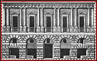
The façade of Bramante's Palazzo Caprini, which was destroyed and is now known only from drawings, was simple in its basic parts. The ground story consisted of a five-bay arcade whose surface was finished in stucco imitating large-stone rusticated masonry. The piano nobile was articulated by pairs of engaged columns of the Roman Doric order. The crowning cornice was detailed as a Doric entablature. All five bays are alike in having pedimented windows between pairs of engaged columns on the second story and rusticated arches on the first.
Previously Used Features
Bramante's design brought together a number of features that had been introduced elsewhere.
●Contrasting materials and textures. The use of contrasting material and textures for the first and second stories of the Palazzo Caprini echoes a similar contrast at the Palazzo Pazzi.
●Patterned rustication. The rustication of the ground story of the Palazzo Caprini takes the patterned form used by Giuliano da Sangallo at the Palazzo Gondi, which includes voussoirs that have horizontally and vertically cut outer facings instead of curved facings. The horizontal and vertical facings enable the voussoirs to interlock with the other stones.
●Paired engaged columns. Bramante's use of the orders to articulate the façade of the Palazzo Caprini differs from Alberti's original use of the orders at the Palazzo Rucellai in several ways. Bramante used the orders on only one story, he used engaged columns instead of pilasters, and he used the columns in pairs instead of singly. Two late 15th-century palaces occupied a transitional position between Alberti's and Bramante's palaces. Like Alberti's palace, these palaces have pilasters instead of engaged columns, and like Bramante's palace, they use these members in pairs and have smooth rustication without the orders on the ground story.
Palaces Influenced by the Palazzo Caprini
Except for Palladio's Palazzo Porto, the following palaces influenced by the Palazzo Caprini were designed by Bramante's followers, who typically first worked in Rome, and then in the 1520s, moved to other parts of Italy. The Palazzo Caprini served not only as a model to be imitated, but also at a point of departure for creative variations in the Mannerist spirit.
♦Palazzo Vidoni-Caffarelli by Raphael, Rome, c. 1515-20
♦Palazzo Stati Maccarani, by Giulio Romano, Rome, 1522-23
♦Palazzo Pompei by Sanmicheli, Verona, 1530s/c.1555
♦Casa Pippi by Giulio Romano, c. 1540
♦La Zecca by Jacopo Sansovino, Venice, 1536-45
♦Palazzo Corner della Ca' Grande by Sansovino, Venice, c. 1535
♦Palazzo Uguccioni by Zanobi Folfi, Florence, 1550s
♦Palazzo Porto by Palladio, Vicenza, 1552
PALAZZO BRANCONIO DELL' AQUILA
Importance as a Stylistic Leader
In the history of Renaissance styles, Raphael's Palazzo Branconio dell' Aquila was a harbinger of the new artistic style known as Mannerism.
Departure from the Palazzo Caprini Type
The Palazzo Branconio dell' Aquila broke away from the classical tradition of Bramante's Palazzo Caprini and the palaces it inspired.
Raphael's palace was similar to the Palazzo Caprini in its classical vocabulary and use of basic features such as its five-bay width, pedimented piano nobile windows, and arcaded ground story. It was different in more important and influential respects, however.
Influential Features
The Palazzo Branconio dell' Aquila's most influential feature was the absence of rustication, which became the norm for palace façades by the end of the century.
The influence of story-high orders as the main decoration of the ground story was less widespread. Raphael's follower Peruzzi used a combination of pilasters and freestanding columns on the façade of the Palazzo Massimo alle Colonne over a decade later.
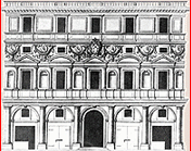
The Palazzo Branconio dell' Aquila was also one of the first palaces to express antiquarian taste. Antiquarian features included such forms as rich veined marble, figural sculpture, and stucco ornament that imitated ancient Roman relief sculpture and medallions. Raphael placed the relief wherever there was empty wall space instead of only on structural parts in the manner of Bramante.
Raphael also claimed the freedom to violate classical norms by such irregularities as alternating triangular and segmental pediments, placing niches over columns, and staggering similar features.
PALAZZO FARNESE
Architects
The Palazzo Farnese was given much of its form by its original architect, Antonio da Sangallo the Younger. After his death, Michelangelo and others modified it during the 43-year period required of its completion.
Importance
The Palazzo Farnese was the most influential palace of the later sixteenth century, and its design affected the design of late-Renaissance and Baroque palaces in Italy and elsewhere in Europe for centuries.
Description
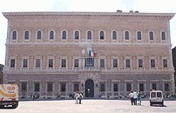
The palace was conceived as a freestanding block with a central courtyard, like the Florentine palace, the Palazzo Strozzi. The design of the façade of the Palazzo Farnese broke with the tradition of contrasting stories, a feature typical of most Renaissance palaces that preceded it. Windows instead of arches were used on the ground story, which did not contain shops. All three stories have a uniform, relatively smooth texture, which gives the building a blockish character that was affirmed by quoins on its corners. A central focal point was achieved by the rustication of the entrance and the massing of pilasters and other ornament around the window over it.
Differences from the Palazzo Caprini
The basic schemes of the Caprini and Farnese palaces are totally different from each other. Instead of differentiating the stories in texture, refinement, and vocabulary while equalizing the bays with matching windows and arches, as seen at the Palazzo Caprini, the stories of the Palazzo Farnese are equalized and the bays are individualized in a hierarchical manner that accentuates the central bay.
Forerunner of Palazzo Farnese
The palace type exemplified by the Palazzo Farnese, whose present form was worked out in the late 1530s, was tentatively realized much earlier at a smaller palace that Antonio also designed, the Palazzo Palma-Baldassini (1516-19). It embodied several features associated with the Palazzo Farnese like quoins at the corners, an accentuated entrance, windows on the ground story, window trims that differed on each story, and plain low-textured wall surfaces on all stories.
Palaces Influenced by Palazzo Farnese
Like the Palazzo Caprini, the Palazzo Farnese could readily be copied due to the distinct character of its individual features, which could be adapted to palaces of other sizes and shapes.
Later in the century, the influence of the Palazzo Farnese was evident on many palaces like the new Lateran Palace (1585-89), a papal palace built by Pope Sixtus V in 1585 to replace an earlier palace that had deteriorated. It resembles the Palazzo Farnese in its basic scheme of three similar stories with same-size, classically framed windows, an accentuated entrance, and quoins on the corners. Like the Palazzo Farnese, the Lateran Palace was also large in size and occupied a piazza.
EXAMPLES OF ROMAN PALACES
♦Bramante's Palazzo Caprini, c. 1510. Bramante's design of the Palazzo Caprini (destroyed) consisted of two main stories of contrasting character. The ground story was faced with stucco imitating rusticated masonry, and the piano nobile was articulated by pairs of Roman-Doric engaged columns carrying a Doric entablature. On the piano nobile, all bays were identical, but on the story below, the forms within the arches varied symmetrically. Bramante took several features from other palaces but changed the character of the whole composition. He organized the ornamental features so that they articulated the structure by accentuating the lines of support. Bramante's design for the Palazzo Caprini became a prototype for many sixteenth-century palaces in places like Rome, Florence, Verona, and Venice.
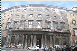
♦Raphael's Palazzo Vidoni-Caffarelli, 1515-20? The Palazzo Vidoni-Caffarelli was originally designed as a seven-bay wide, two-story high palace. In the eighteenth century, it was expanded to its present seventeen bays. The design was patterned after Bramante's Palazzo Caprini in having a rusticated ground story that is subordinate to its more decorative piano nobile, which is articulated by pairs of engaged columns that support an entablature. However, the one-to-one relationship between the five windows of the piano nobile and the five arches of the ground floor established by Bramante's palace is lost at the Palazzo Vidoni-Caffarelli due to the alternation of windows and doors on the lower story. This palace also varies from Bramante's in details like pediment placement and the use of a single rather than two separate bases to support column pairs. The latter is a Mannerist feature in that it creates ambiguity by grouping features from separate bays. The attribution of the palace to Raphael is not accepted by all scholars; some believe the palace dates to the 1520s and is the work of one of Raphael's assistants.
♦Raphael's Palazzo Branconio dell' Aquila, Rome, c. 1518-20. The Palazzo Branconio dell' Aquila, which was torn down in the seventeenth century, is significant for its stylistic departure from the tradition of Bramante. Although it was like the Palazzo Caprini in its use of a classical vocabulary and its basic features, the Palazzo Branconio differed from it in not using rustication, in using the orders on the ground story, and in using ornament autonomously. Classical rules were also violated by such devices as alternating triangular and segmental pediments over windows, placing niches above columns, and staggering columns of different sizes. Richness was achieved using colored and veined marble and Roman inspired sculpture, which appealed to antiquarian tastes.
♦Antonio da Sangallo the Younger's Palazzo Palma-Baldassini, 1514-22. Contemporary with Raphael's Roman palaces was the Palazzo Palma-Baldassini, a seven-bay palace by Antonio da Sangallo the Younger. It anticipated the Palazzo Farnese in having quoins at the corners, an accentuated entrance, windows on the ground story, window trims that differed on each story, and a plain, low-textured wall surface on all stories.
♦Giulio Romano's Palazzo Stati Maccarani, Rome, c.1522-23. The Palazzo Stati Maccarani, now called the Palazzo di Brazzà, resembles Bramante's Palazzo Caprini in a number of basic features. The ground story is similar in being rusticated and using large-scale, precisely shaped blocks of simulated stone but different in using a series of flat arches instead of an arcade of round arches. Giulio's doorway also differs in being taller than the side arches. The piano nobile, which was executed in stucco, is similar to that of the Palazzo Caprini in using story-high orders and pediment-topped windows. It is different in using shallow pilasters instead of half-round columns. It also differs in having an alternation of triangular and segmental pediments, a feature that Raphael revived from antiquity. The third story echoes the piano nobile in a smaller scale and lower projection. Despite these similarities, the Palazzo Stati Maccarani differs from the Palazzo Caprini in very important ways. The emphasis resides on the lower story, where stacks of blocks frame the doorway and oversized voussoirs create an appearance of force and movement. This dynamic handling of masonry became part of Giulio's lifelong vocabulary of architectural elements.
♦Peruzzi's Palazzo Massimo alle Colonne, begun 1532. The Palazzo Massimo alle Colonne, which was Peruzzi's most important and original architectural work, has a number of Mannerist irregularities like a curved façade and a lack of stringcourses, which makes the upper windows appear to float. The use of the orders on the ground story followed Raphael's precedent at the Palazzo Branconio dell' Aquila, but the use of freestanding columns was new to palace design. The narrowness of the site necessitated an irregular plan whose spaces are often long and narrow. The courtyard, which has loggias only at the ends, is different on each facing.
♦Antonio da Sangallo the Younger's and Michelangelo's Palazzo Farnese, 1517-89. Antonio's finest work is the Palazzo Farnese, which, like the Vatican projects, he worked on for much of his life (1514-46). He determined the plan, the design of the windows, and the masonry of tan brick with quoins on the corners. Antonio completed many major parts of the building, including the main entrance and vestibule, two stories of the courtyard, and the ground story loggia on the rear wing. He died in 1546 before the cornice and rear wing were begun. His successor, Michelangelo, changed the design of the cornice to one that was far larger in relation to the palace's immense size. In the same vein, he enlarged the upper section of the entrance, making it more emphatic and ornate. Michelangelo modified Antonio's three-stories of superimposed loggias by closing the upper stories and inserting windows. The rear wing was completed by Vignola and Giacomo della Porta.
♦Domenico Fontana's Lateran Palace, 1585-89. The Lateran Palace, which is attached to San Giovanni in Laterano, was designed by Domenico Fontana for Pope Sixtus V as a summer residence. It replaced the deteriorated earlier palace, the "Patriarchate," which had been the pope's residence before the Great Schism. The Lateran palace is similar to the Palazzo Farnese in having three stories of the same height with similarly sized, classically framed windows, portal bays that are accentuated on the first two stories, and quoins on the corners.
DESIGN OF FLORENTINE PALACES
15th-Century Florentine Palaces
By the beginning of the sixteenth century, the courtyard-centered structure that had become typical of Florentine palaces and was first defined by the Palazzo Medici, had reached a peak of refinement in the Gondi and Strozzi palaces.
Influence of Roman Windows
In the late fifteenth century, Roman influence was demonstrated in isolated features such as rectangular windows like those of the Palazzo Venezia. Similar windows were built in the 1490s on the courtyard facings of the Gondi and Strozzi palaces.
Influential Roman Palaces
The development of palaces in Florence in the sixteenth century was strongly affected by the new types developed in Rome during the early sixteenth century.
●Influence of the Palazzo Caprini. The Palazzo Caprini, the first of the new influential models built in Rome, was clearly the model for the Palazzo Uguccioni, which maintains the same use of rustication and classical orders on the first two stories.
●Influence of the Palazzo Farnese. Although the Palazzo Farnese was not completed until 1589, its influence arrived much earlier through a palace designed by Raphael. Raphael lived in Rome and would have known the Palazzo Palma-Baldassini and the entrance wing of the Palazzo Farnese, which were both designed by Antonio da Sangallo the Younger, who worked under him at St. Peter's. The Palazzo Pandolfini was built by the Sangallo family in Florence. If completed, the Palazzo Pandolfini would have resembled a two-story version of the Palazzo Farnese in having a uniform low-textured wall treatment on all stories, quoins on the corners, rustication on the entrance bay, and an alternation of triangular and segmental pediments on the piano nobile. Its basic scheme differed from that of the Palazzo Farnese in having only two stories and in alternating triangular and segmental pediments on the top story. A later Florentine palace in the Farnese tradition, the Palazzo Grifoni, was designed by Ammannati. He would have seen the Palazzo Farnese while working at the Villa Giulia in Rome in the 1550s.
Examples of Florentine Palaces
♦Raphael's Palazzo Pandolfini, begun c. 1518. Compared with Raphael's Roman palaces, the Palazzo Pandolfini is far simpler and more in keeping with Florentine tastes. The alternation of triangular and segmental pediments over the windows was also used by Raphael on the Palazzo Branconio dell' Aquila. The Palazzo Pandolfini reflects the trend toward two-story palaces that was current in Rome, and because of its horizontal spread, it looks more like a villa than a palace. The palace's unusual elevation combining one and two-story sections is probably a consequence of it not having been finished under its original patron, Giannozzo Pandolfini, who probably planned to complete a nine-bay, two-story palace. Its main parts are a two-story block that is connected to a one-story three-room wing by a central entrance hall. The resulting L-shape encloses a rectangular garden that is bounded by walls on the other two sides. The decoration of the exterior is concentrated on architectural features like the string course, the entablature, and the window surrounds. These features formed a new palace type that had just been introduced in Rome by Antonio da Sangallo the Younger, whose later façade of the Palazzo Farnese was similar. The Palazzo Pandolfini's rusticated entrance and quoins on the corners stand out prominently against the plaster walls. The interior was decorated with painted stucco ceilings and illusionistically painted walls that imitate such forms as atlantes.
♦Palazzo Uguccioni, Piazza della Signoria, Florence, 1550s. The Palazzo Uguccioni is similar to the Palazzo Caprini in having a rusticated ground floor and pairs of engaged columns ornamenting the upper stories. The upper stories are distinguished from each other by different orders, the Ionic versus the Corinthian, and by different pediment shapes over the windows, segmental versus triangular. Its three-story height and narrow three-bay width radically change the palace's proportions, making it taller than wide.
♦Ammannati's Palazzo Grifoni, Piazza della Annunziata, 1557-63. Ammannati built the Palazzo Grifoni for Ugolino Grifoni in 1557. It follows the Palazzo Farnese type in having an even texture from story to story, same-size windows, a rusticated entrance bay at the center, quoins at the corners, and pedimented windows on two stories. The lower-story windows resemble those designed by Michelangelo for the Palazzo Medici.


 Add Placemark
 Go Back


