Palazzo Massimo alle Colonne
Rome, begun 1532
Architect: Peruzzi
BACKGROUND
Palace Complex
The Palazzo Massimo alle Colonne in Rome was designed by Peruzzi for Pietro Massimo in 1532.
The palace was part of the Massimo family complex, which consisted of two new palaces for the Massimo brothers, Pietro and Angelo, and the portion that remained from the original family palace after its partial burning during the Sack of Rome.
Name
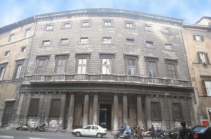
The name Palazzo Massimo alle Colonne refers to the freestanding columns on the façade, which distinguished this palace from the other palaces up to that time.
SITE-CONDITIONED FAÇADE FEATURES
Problems of Site's Shape and Location
One of the main determinants of the design of the façade of the Palazzo Massimo alle Colonne is the site: its street facing is curved and not centered with the incoming street.
Placement of Entrance Portal
Because the site did not originally include the palace's left front corner, Peruzzi was forced to choose between centering the palace's entrance with the façade or with the oncoming street. His decision for the latter may have been influenced by the fact that the whole façade could not be seen from the front because of the narrowness of the street, which was later widened from its original twelve-foot width.
Use of Curved Plane and Loggia
Peruzzi's ultimate solution to the curved site was to incorporate its contour into the façade. The curve's impact is minimized at the street level by the use of a loggia at the front. The opening between the centermost columns, where the curved angle of the façade is greatest, is wider than the other openings.
The recessed portico provides a convenient sheltered area between the vestibule and the street. It was richly decorated by a coffered ceiling and apses containing sculpture at the ends.
Although the use of the orders on the ground story had precedent in Raphael's use of engaged columns on the Palazzo Branconio dell' Aquila, the use of freestanding columns that served as functional supports was new to palace façades.
MANNERIST FEATURES OF THE FAÇADE
Comparison with Palazzo Caprini
The Palazzo Massimo alle Colonne reflects the Mannerist inclination to diverge from the classical norms exemplified by Bramante's Palazzo Caprini, the archetypal palace of the High Renaissance. In comparing the two palaces, a number of its irregularities besides the site-conditioned curved façade are apparent.
Recessed Loggia at Entrance
Most striking is the inclusion of a recessed loggia, which minimizes the perception of the façade's curve.
As at the Palazzo Caprini, the orders are grouped in pairs, but unlike it, two of the pairs are irregular in combining a freestanding column with a pilaster.
Inversion of the Orders and Rustication
The story using the orders is located below the all-rusticated stories, which is an inversion of the Bramantian model consisting of a ground story that is rusticated and a piano nobile that is ornamented by the orders.
Floating Upper Windows
Because there are no stringcourses appearing to support the upper windows, they seem unanchored amid the continuous pattern of smooth rustication.
Unusual Window Trims
The windows above the large piano nobile windows have unusual frames formed by scrolls whose free curves present a lively contrast with the straight lines of the rustication and other window trims.
Ambiguity of Parts
The balconies below the piano nobile windows act both to extend the vertical lines of the windows and, in conjunction with sections of trim between the balconies, to create a horizontal band above the entablature.
INTERIOR
Difficulties of the Site
Certain conditions of the site, namely its narrowness and the presence of parts of the old palace, posed limitations on the palace's design.
Off-Center Placement of Large Parts
Because the palace is too narrow to have rooms on both sides of large spaces that are usually centrally located such as the courtyard and the vestibule, these areas are not centered with the whole palace or with each other.
Elongation of Proportions
The lengths of the larger areas are considerably greater than their widths, and areas that are normally long, like the vestibule, are unusually narrow.
Decoration of Interior
Many of the ceilings were coffered in elaborate, geometric patterns. The staircase ceiling is an especially fine example of this form.
The coffering of the grand salone was based on a grid pattern of squares and rectangles whose pattern is coordinated with the spacing of the pilasters and paneling of the walls.
Windows on two levels illuminate the room.
COURTYARD
Use of Loggias Only on Ends
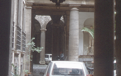
The use of loggias only at the two ends of the courtyard is consistent with the typical design of Roman domestic palaces at this time. Using loggias around all four facings like the courtyards of some of Rome's larger ecclesiastic palaces would have required making the other rooms too narrow. (The courtyard of Angelo's palace, whose width was similarly restricted, also has loggias on only its ends.)
Lack of Continuity from Side to Side
The lack of continuity in the courtyard between adjacent facings was the result of not only the use of loggias on only the two ends but also the discrepancy in story height between the old and new family palaces.
Presence of a Mezzanine Story
Because the stories of the old palace were shorter, a false mezzanine level was added to conceal the disparate story heights.
By hiding the vaulting of the new palace, the faux mezzanine level makes the ground story of the new palace appear shorter, like that of the old palace.
Peruzzi exploited these contrasts to create an element of surprise, which was part of the aesthetic basis of Mannerism.
See visual summary by clicking the Views button below.


 Add Placemark
 Go Back


