Palazzo del Tè
Mantua, c.1526-34
Architect: Giulio Romano
BACKGROUND
Commission
In 1526 Federico II Gonzaga, directed his court architect Giulio Romano to design a villa. Two years earlier, Federico had negotiated a contract for him to leave his native city of Rome to work for him in Mantua.
Building Type
Despite the "palace" reference in its name, the Palazzo del Tè is actually a villa of the villa suburbana type.
Location
The Palazzo del Tè is located just outside Mantua on the island of Tè. It was built adjacent to the famous Gonzaga stables. The walls of one of the villa's rooms portrayed some of Federico's most prized horses.
Two Phases of Construction
Planning and construction took place in two phases.
♦1526-28: North Wing. The project that became the Palazzo del Tè was originally conceived as an enlargement of an existing structure. The north wing, as it is now called, was intended to provide a place where the marquis could relax and socialize with guests after riding. This wing's largest room, the Sala dei Cavalli, was decorated with portraits of his favorite horses.
♦1528-34: Remaining Wings. After seeing Giulio's impressive work on the north wing, Federico decided upon a radical expansion that was to quadruple the villa's size.
BASIC DESIGN
Plan
The villa is made up of four wings of equal length that define a piazza-size quadrangle. All four wings have vestibules at the center, and three of these contain entrances.
At the rear, a rectangular pond extends the length of the garden wing, and a bridge connects the garden loggia with the parterre. Grottos were built in the far corners of the garden.
Proportions
Because the width-to-height ratio of the individual wings is approximately four to one, the exterior of the Palazzo del Tè has the long, low look of Raphael's main building of the Villa Madama, which Giulio knew well from having painted part of its decoration.
Colossal Order Pilasters
The exterior is articulated by pilasters of the colossal order, which mark the separate bays, This is another point of resemblance with the Villa Madama.
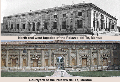
FAÇADES OF NORTH AND WEST WINGS
Wall Surfaces
The building's plain shape is enlivened by vigorously textured wall surfaces, which were created by the use of rustication, whose textural vigor is set off by the smooth pilasters.
=Rusticated masonry. A brick core was covered by masonry using cast-concrete blocks that simulated large stones. The windows and doors are framed by boldly projecting large and small textured blocks, which form a sharp contrast to the smooth blocks of uniform size that form the wall plane.
=Colossal orders. The bays are articulated by Doric pilasters, which appear to support a Doric entablature. The frieze's triglyphs and metopes contribute to the building's textural variety.
Bay Types and Arrangements
The north and west façades utilize similar types of bays, which are distinguished by width and the presence of doors, windows, niches, and extra pilasters.
The arrangement of the various bay types is different on each façade and is not a simple repetition on either.
On the west wing, all the window bays on each side of the entrance are together and framed collectively by a niche bay on each side, but on the north wing, the four window bays on each side are split 3:1 by a niche bay.
Pairs of pilasters separated by narrow strips of wall stand on the corners of both façades, making the juncture of these unlike facings more compatible.
Modifications to the North Wing
In later centuries, modifications were made to the original appearance, which was recorded by engraved elevations made by Ippolito Andreasi in the seventeenth century.
On the north façade, three attic windows above the three arches originally accentuated the center and added further complexity.
ENTRANCE VESTIBULE
Similarity to Palazzo Farnese's Vestibule
The villa's main entrance, the west vestibule, is similar to the vestibule of the Palazzo Farnese, which was built in the 1510s. Both have central barrel vaults flanked by side aisles that have flat ceilings and are not open on the exterior. Both also utilize the Roman Doric order.
Textural Contrasts
The roughly textured columns form a strong contrast to the finely finished ceiling.
Coffering
The pattern of the coffering, like that of the Basilica of Constantine, is formed by octagons interspersed with small squares.
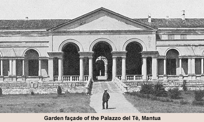
GARDEN FAÇADE
Differences from North and West Façades
Many differences distinguish the garden façade from the north and west façades.
●Smooth texture. Largely because the garden façade's architectural vocabulary is based on the orders rather than on rustication, the garden facing has smooth surfaces that emphasize its forms.
●Spatial depth. The garden façade has greater spatial depth due to the presence of a loggia and balconies, which form a screen in front of the walls enclosing the interior.
●Rectangle-and-arch configurations. Rectangular openings formed by the orders are combined with arches in a configuration that anticipates the Palladian motif. The configuration's rhythm gives the garden façade a lighter, more elegant character.
●Freestanding columns. Freestanding, load-bearing columns are used in combination with pilasters.
Similarity in Arrangement to Other Façades
Despite its totally different vocabulary, the garden façade is related to the north façade by a similar arrangement of features. Both have a three-part entrance flanked by three windows/balconies, a niche, a fourth window/balcony, and a sliver of plain wall between pilasters at the corners.
Later Modifications to the Garden Façade
According to engravings made of the exterior façades by Ippolito Andreasi in the next century, the garden front was modified more radically than the other façades.
The garden loggia was given greater accentuation by the addition of a pediment designed by the architect-painter Pozzo in 1774. Originally, roof-level galleries crowned all the wings.
GARDEN LOGGIA
Entrance from Courtyard
Entrance to the garden loggia from the courtyard is through a single-bay doorway.
Interior
The loggia is vaulted by a barrel vault, which is decorated by frescoes organized according to a grid pattern.
The walls and piers are hollowed out between the pilasters by niches containing statues.
Supports
The loggia's most striking feature is the support system. On the courtyard side, the vaulting is supported by massive piers, but on the garden facing, it is supported by groupings of four-Doric columns. This provides less obstruction to viewing the gardens and gives the loggia an airy quality.
COURTYARD
Planting as a Maze
The quadrangle was originally planted as a maze, which added both an aesthetically desirable feature and a symbolic reference to the Gonzaga family, whose family emblem included a maze device.
Similarities to the Exterior in Vocabulary
The individual facings of the courtyard are similar to the exterior facings of the north and west wings in their vocabulary.
Differences from the Exterior in Vocabulary
There are a number of differences in vocabulary between the courtyard and the exterior façades.
=Column form. Except at the corners, the courtyard wall is articulated by engaged columns instead of pilasters or freestanding columns, which were used on the façades of the entrance and the garden.
=Masonry. The blocks of the courtyard's masonry project further outward and are larger and more varied in size. Blocks framing openings were distinguished by rough texture.
●Stringcourses. Stringcourses, which are used on all the exterior facings, are used only on the north and south facings of the courtyard. Consequently, there is a break in continuity at each corner of the courtyard.
Similarities between Facing Pairs of Walls
Walls that face each other are related by the arrangement of such features as doors, windows, and niches.
=North and south facings. The north and south facings both have triple-bay arcaded entrances flanked by windows and secondary doors. The trio of arches at the centers of both walls differ; at the north facing they are opened as a loggia while at the south facing, they are occupied by windows flanking a door.
=East and west facings. The east facing of the courtyard mirrors the west facing in having a pedimented single-bay entrance flanked by narrow bays containing apsidal niches in alternation with wide bays containing rectangular niches. This rhythm reflects the influence of Bramante's travata ritmica at the upper terrace of the Belvedere Court at the Vatican. The two doorways differ in whether the pediment is carried by columns or consoles.
MANNERISM IN THE COURTYARD
Significance of Placement in Courtyard
The Mannerist aspects of the villa are most evident in the courtyard, where flagrant violations of the rules of Classical architecture occur. Certain features go well beyond the irregularities of spacing and lack of continuity found on the exterior.
The placement of the more radical features in the villa's courtyard, where they would be visible only to the Gonzaga family and their guests, suggests that they were intended to provide intellectual amusement, an intent that is consistent with the general function of Italian villas as places of leisure and recreation.
Background to Its Humor
Many of Giulio's modifications to Classically derived features underscore the gap in functionalism between them and the original forms. Consequently, the full impact of the joke depends on understanding the functions and derivations of the individual architectural components.
Giulio's irregularities appealed to visitors who enjoyed being shocked by the audacity of his irregularities and delighted by their wittiness.
Mannerist Features
A number of Mannerist features were incorporated into the design of the courtyard. The original painted decoration has been lost, but it probably contributed to the appearance of disorder and instability.
●Discontinuity from facing to facing. String courses and other continuous features are omitted on alternate facings.
●Violations of the pediment. Because a pediment was originally a form of pitched roof, its triangular shape was essential to the roof's stability. Consequently, the intrusion of keystones or voussoirs into pediments underscores their lack of functionality in Renaissance usage.
●Merging of pediment and arch. Because pediments and arches are constituents of two different building systems (trabeated and arcuated), their merging produces a redundancy that accentuates the lack of functionalism of the pediment.
●Violations of the frieze. The Doric frieze is violated by the absence of some of its metopes and by the dropped positions of some of its triglyphs.
●Ambiguities created by the masonry. Doors and windows are framed by alternating large and small textured blocks that are continuous with the bond of the adjacent wall rather than distinct from it, as was generally the case when trimming members were used.
●Curving blind panels. The planes of some blind panels, which are usually flat, are curved to the extent of overfilling their frames.
INTERIOR
Overview
Giulio, who had been trained as a painter under Raphael, was also responsible for the decoration of the interior. Like Raphael and Peruzzi, he integrated the architecture and decoration into a single, aesthetically unified whole.
The most important rooms were accentuated by size or placement on corners.
Sala dei Cavalli
The Gonzaga stables are celebrated in the Sala dei Cavalli by an illusionistically painted scheme of horses and statues in an architectural setting. The Duke's favorite horses appear to stand on ledges and cast shadows, and statues of mythological deities appear to stand in niches between them.
Sala di Psiche
The walls of the Sala di Psiche (1528) are painted with scenes illustrating the story of Cupid and Psyche from classical mythology. At their wedding feast, which covers two walls, eating, drinking, and other sensual pleasures are enjoyed by wedding guests such as satyrs and woodland nymphs. The giant Polyphemus is included as well.
Sala dei Gigante
The Sala dei Gigante was designed to provide a continuous field for Giulio's illusionistic depiction of the Battle of the Gods and Giants (1532-34), which envelopes the whole room. It depicts the gods on a ring of clouds that surrounds a dome. The warrior gods hurl thunderbolts down onto the rebellious giants, who had piled up stones to mount their siege on Mount Olympus, the home of the Greek and Roman gods.
See visual summary by clicking the Views button below.


 Add Placemark
 Go Back


