16th-Century Palaces in Northern Italy
ROMAN INFLUENCE
Roman Background of Leading Architects
The leading architects in northern Italy during the sixteenth century were Michele Sanmicheli, Jacopo Sansovino, Giulio Romano, Sebastiano Serlio, and Andrea Palladio. All except Palladio had undergone training and begun their careers in Rome, where they had witnessed the latest architectural developments under Bramante and Raphael.
The departures from Rome of Sanmicheli and Romano were prompted by lucrative contracts in the mid 1520s, and those of Sansovino and Serlio were precipitated by the Sack of Rome in 1527.
Palladio, who was a generation younger than the other named architects, made up for his lack of training in Rome by making several trips to study the city's architecture. His understanding of Rome's ancient architecture is demonstrated by his publication of an illustrated guide of Rome's ancient architecture and his illustrations for Daniele Barbaro's annotated edition of Vitruvius' De architectura.
Northward Relocation of Roman Architects
The Roman-trained architects who moved north settled in three major cities: Verona, Mantua, and Venice.
Sanmicheli, who was originally from Verona, returned when he was offered employment as a military engineer.
Giulio Romano, whose name reflects his Roman origin, moved to Mantua to become the court architect of Federico II Gonzaga.
Jacopo Sansovino, who was born in Florence, settled in Venice and soon became the city's chief architect.
Sebastiano Serlio, who was born in Bologna and trained in Rome as a painter and draftsman by Peruzzi, spent a decade in Venice before moving to France. Serlio's influence was primarily through his treatise,Tutte l'opera d'architettura et prospective, whose first-written books were published in Venice in 1537 and 1540.
Three Influential Roman Palace Façades
Three palace façades in Rome that were designed by leading architects and begun in the 1510s were especially influential, and variations of them were constructed during the rest of the century.
1. Palazzo Caprini, c. 1510 (Bramante). Bramante's facade of the Palazzo Caprini (destroyed) consisted of two main stories of contrasting character. The ground story was faced with stucco imitating rusticated masonry, and the piano nobile was articulated by pairs of Roman-Doric engaged columns carrying a Doric entablature. On the piano nobile, all bays were identical (except for the extra support at the corners), but on the story below, the forms within the arches varied symmetrically. Bramante took several features from other palaces but changed the character of the whole composition. He organized the ornamental features so that they articulated the structure by accentuating the lines of support. The Palazzo Caprini served not only as a model to be imitated, but also as a point of departure for creative variations in the Mannerist spirit by Sanmicheli, Giulio Romano, Sansovino, and Palladio.
2. Palazzo Branconio dell' Aquila, 1518-20 (Raphael). Raphael's Palazzo Branconio dell' Aquila, which was later torn down, is significant for its stylistic departure from the tradition of Bramante. Although it was like the Palazzo Caprini in its use of a classical vocabulary and its basic features, the Palazzo Branconio differed from it in using ornament autonomously, substituting the orders for rustication on the ground story, and violating classical rules. This was accomplished by such devices as alternating triangular and segmental pediments over windows and placing niches above columns, which caused the columns to be staggered. Richness was achieved using colored and veined marble and antique materials like reliefs, whose use constituted an early instance of antiquarianism. The Palazzo Branconio dell' Aquila was influential not so much for its specific forms as for its general freedom from the use of traditional features like rustication on the ground story and the orders on the piano nobile and for its general decorativeness.
3. Palazzo Farnese, 1517-89 (Antonio da Sangallo the Younger and Michelangelo). Antonio da Sangallo the Younger's finest work is the Palazzo Farnese, which, like the Vatican projects, he worked on for much of his life (1514-46). He determined the plan, the design of the windows, and the masonry of tan brick with quoins on the corners. Antonio completed many major parts of the building, including the main entrance and vestibule, two stories of the courtyard, and the ground story loggia on the rear wing. He died in 1546, before the cornice and rear wing were begun. His successor, Michelangelo, changed the design of the cornice to one that was far larger in relation to the palace's immense size. In the same vein, he enlarged the upper section of the entrance, making it more emphatic and ornate. Michelangelo modified Antonio's courtyard design of three-stories of open loggias by closing the upper stories and inserting windows.
MANTUAN PALACES
Stability and Prosperity
Mantua, a city of moderate size, prospered in the Renaissance under the rule of the Gonzaga family, whose diplomatic skill in dealing with their powerful neighbors enabled the city to maintain autonomy. The presence of swampy lakes provided natural defenses on three sides. Mantua also benefited from being located along a riverine route between Europe and the Mediterranean Sea.
Recruitment of Giulio Romano
The most important architect working in Mantua during the sixteenth century was Giulio Romano, who moved to the city in 1524 at the invitation of Federico II. Federico's agent in Rome, Baldassare Castiglione, recommended Romano and negotiated the contract between them.
Examples of Palaces in Mantua
The palace that Giulio Romano built for himself was one of the most architecturally significant in Mantua.
♦Giulio Romano's Casa Pippi, c. 1540. Around 1540, Giulio Romano began the remodeling of the Casa Pippi, a house he bought for himself in Mantua. The unusual nature of its façade can best be appreciated by comparing it with that of Bramante's Palazzo Caprini, with which it shared several general features. It differs from the Palazzo Caprini and other palaces in having a number of unusual features including such functionally redundant combinations as an arch with a lintel and arches with pediments.
VERONESE PALACES
Location and Commerce
Verona's location on major trade routes and on a river that flowed to the Adriatic Sea contributed to the city's prosperity as a center of commerce.
Venetian Political Control
Verona was annexed by Venice in 1405, and except for a brief period of domination by Austria at the beginning of the sixteenth century, Verona was part of the Republic of Venice throughout the Renaissance.
Improving Verona's Fortifications
In the early sixteenth century, when Milan and much of Lombardy were dominated by the Holy Roman Empire, Venice required Verona to improve its fortifications to prevent neighboring forces from seizing control. Maintaining strong defenses along its frontiers was part of the Venetian Republic's policy of armed neutrality toward its northern neighbors.
For this program, Verona engaged Michele Sanmicheli, a native of Verona who had designed fortifications for Orvieto and assisted Antonio da Sangallo the Younger on a trip around Italy to assess the fortifications of papal holdings.
Examples of Palaces in Verona
In addition to designing several much-admired city gates in Verona during the decades that followed, Sanmicheli designed a number of private palaces there. The influence of the Roman palaces of Bramante and Raphael is evident on Sanmicheli's palaces in Verona.
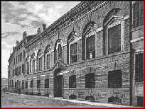
♦Sanmicheli's Palazzo Pompei, Verona, c. 1555. The Palazzo Pompei, like many urban palaces, was deeper than wide. The façade shows the influence of Bramante's Palazzo Caprini, which it resembles in having a simple, two-story composition consisting of a rusticated ground story above a piano nobile that is ornamented by Doric columns carrying an entablature, classically inspired trim around the windows, and balustrades below the windows. The differences between the two palaces include not using flat arches on the ground story, using single columns between the windows, and varying the widths of the bays. At the center, the distance between the columns framing the central arch on each story is greater than the distance between the columns framing the other arches. The outer bays are inherently wider because they include the full extent of the outer piers, which is faced with fluted pilasters, whereas the extent of the inner bays includes only one half-pier on each side.
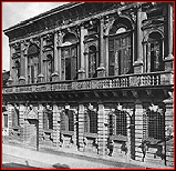
♦Sanmicheli's Palazzo Bevilacqua, Verona, c. 1530. The façade of the Palazzo Bevilacqua is composed of a complicated mixture of forms on both the rusticated ground story and the highly refined piano nobile. The latter includes a variety of moldings and forms of relief sculpture. There are three types of fluting--vertical, right spiral, and left spiral. Mannerist irregularities include the use of two shapes of pediment in a symmetrical arrangement and the use of wide and narrow bays, which reflects the influence of Bramante's travata ritmica.
VENETIAN PALACES
General Conditions
Venice's prosperity was reflected by the many fine palaces that lined the Grand Canal.
Because of the extreme conditions posed by the water-based site, a number of site-related features persisted despite stylistic changes.
Fifteenth-Century Background
By the beginning of the sixteenth century, the transition from the older Byzantine and Gothic style was evident in the work of Mauro Codussi. His palaces, the Palazzo Corner-Spinelli and the Palazzo Vendramin-Calergi, demonstrate a familiarity with central-Italian architecture and the ideas of Alberti. Codussi's work employed a number of features that were new to Venice.
Plans
The narrow and deep proportions typical of Venetian palaces reflected the limited availability of canal frontage. Because the foundations of Venetian buildings rested on poles driven through the silt layer, it was necessary to use a plan that maximized stability. A three-part plan evolved in which a center section running from front to back was braced by side sections, which were usually sub-divided into smaller areas.
Arrangement of Rooms
Venetian palaces used the same basic arrangement of rooms throughout the Renaissance.
Because dampness made the ground story unsuitable for living quarters, it usually functioned as a warehouse for goods that the palace owner had imported from the East for re-sale in Italy and Europe. Storage rooms lined the sides of the ground story, and a mezzanine provided space for dry storage.
A long hall on the ground story connected the waterfront entrance portico with a courtyard at the rear. This hall, called the androne, was sometimes used for banquets or other festivities that were too large for the reception room on the story above. In the sixteenth century, the character of the ground-story central hall evolved from utilitarian to formal.
On the piano nobile, the center was occupied by the grand salone, which ran perpendicular to the façade and faced out on the canal.
Façades
The central issue involved with the design of Venetian palace façades was reconciling the classical principles of regularity with the traditional Venetian three-part arrangement in which the center and sides differ in design. Typically, the windows on the piano nobile were clustered in the center and set between sections of wall at the sides.
●Irregular spacing of orders. On Mauro Codussi's façade of the Palazzo Vendramin-Calergi, the distinction between the center and outer bays is accentuated by the use of columns in pairs on the latter. Because columns at Sansovino's Palazzo Dolfin are used singly between the windows, their spacing, like that of the windows, is closer in the center. The use of an arcade on the ground story adds an element of regularity.
●Regular spacing of orders. At the Palazzo Corner della Ca' Grande, Sansovino achieved an appearance of regularity by using pairs of columns between all the upper-story windows. This enabled the windows, which differed in width, to appear the same size. Wider windows were used in the center where light was needed for the central hall, and narrower windows flanked by wider wall areas were used along the sides, where the extra bracing of solid outer walls helped brace the less-stable center section. The three-arch entrance is the first of its kind in Venice.
●Center-emphatic use of orders. A decade later at the Palazzo Grimani, Sanmicheli used a tripartite design not only for the ground-story entrance but also for the upper stories, which increased the distinction between the center and sides of the whole palace. He maintained continuity between the central and outer sections by repeating the arched form of the centermost bay on the sides. His doubling of the columns of the outer sections is reminiscent of the Palazzo Vendramin-Calergi.
Examples of Palaces in Venice
♦Sansovino's Palazzo Dolfin, Venice, begun 1538. The upper stories of the Palazzo Dolfin, Jacopo Sansovino's first palace in Venice, are organized in the traditional three-part manner in which windows are clustered in the middle section and spaced out on the outer sections. Columns and pilasters are also spaced closer together at the center than at the sides. The arcade on the ground story, which serves as a public thoroughfare, reflects the crowded conditions of the site. The most innovative feature of the Palazzo Dolfin is the courtyard, whose facings were coordinated to form a unified architectural enclosure. (Up to then, Venetian courtyards were little more than light wells whose separate facings generally lacked continuity.)
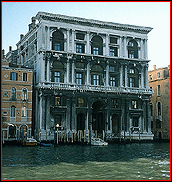
♦Sansovino's Palazzo Corner della Ca' Grande, begun c. 1545. The Palazzo Corner della Ca' Grande, which is located along the Grand Canal, is a very large and ornate palace whose six stories are articulated as three. On the interior, the central corridor on the ground story and the grand salone on the piano nobile, are two-stories high. The façade of the Palazzo Corner della Ca' Grande includes a number of features that had been introduced in Rome by Bramante while retaining some elements of the traditional Venetian three-part composition. Because of the doubling of the columns between the windows on the upper stories, the bays seem more alike than they do on earlier Venetian palaces. Despite this regularity, the palace has a number of Mannerist features such as the ground-story windows.
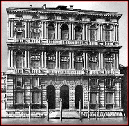
♦Sanmicheli's Palazzo Grimani, Venice, begun 1556. The Palazzo Grimani by Sanmicheli is a large six-story palace whose façade is articulated as three stories by the orders in two sizes. The column form, engaged or pilaster, varies with its placement and size. The façade's traditional Venetian division into a center and side sections is accentuated by the use of centralized configurations and rhythmic variations in the shape and widths of the windows. The palace's interior reflects the typical Venetian arrangement in which a long hall through the ground story leads to staircases up to the piano nobile. In having a high center aisle flanked by lower side aisles, the vestibule corresponds to the entrance's large central arch flanked by smaller arches.
VICENZAN PALACES
The City's Prosperity
Vicenza's prosperity was primarily based on its agricultural production. Some textiles were manufactured there as well, and commerce was facilitated by the two rivers that passed through the city, the Bacchiglione and the Retrone.
Palladio's Palace Design
A native of Padua, Andrea Palladio moved to Vicenza in the 1530s, and over the years, he designed many important palaces. His early palaces showed the influence of architects like Bramante and Romano.
Palladio's Use of the Orders
Palladio used the orders in several ways that were new or uncommon.
●Orders in colossal size. The first domestic palace façade to use the giant order is Palladio's Palazzo Valmarana, which has two-story tall pilasters, whose size is accentuated by the use of a secondary order. Palladio repeated the use of the colossal order using engaged columns and no secondary order on the Palazzo Porto-Breganze, which was not completed.
●Orders decorating walls on first two stories. At the Palazzo Barbarano da Porto, Palladio used story-high engaged columns on both stories, which are distinguished from each other by wall texture. (Sixteenth-century Roman palaces typically used the orders on only one of the first two stories.)
●Orders forming loggias. On the Palazzo Chiericati's ground story, freestanding columns form a public loggia spanning the building's entire width, and on the piano nobile, the columns form private loggias on each side of a pilaster-decorated central section.
Examples of Palladio's Palaces in Vicenza
As the city where Palladio worked for most of his architectural career, Vicenza can claim eight private palaces of his design.
♦Palazzo Thiene, Vicenza, 1542-c.1558. The Palazzo Thiene, which is one of Palladio's earliest palaces, is not characteristic of his mature style. Its vigorous rustication on both stories and numerous other Mannerist features suggest the influence of Giulio Romano, who was said by Vincenzo Scamozzi, a Venetian architect who finished some of Palladio's buildings, to have begun the palace.
♦Palazzo Chiericati, Piazza dell'Isola, Vicenza, begun c.1547. The loggias of the Palazzo Chiericati are distinct in both their design and their use on the palace's front. They are formed by colonnades carrying entablatures instead of piers carrying arcades. A single loggia extends across the palace's full width on the ground story, and two smaller loggias occupy the outer sections on the piano nobile. This arrangement creates a reversal of a tripartite façade, which reverses the more typical scheme of locating recessions in the center, as seen on the rear of the Palazzo Farnese and on many villas, including some by Palladio himself.
♦Palazzo Porto, Vicenza, 1552. The Palazzo Porto shows the influence of Bramante's Palazzo Caprini in its basic scheme of a relatively plain rusticated ground story below a more decorative piano nobile that is articulated by engaged columns between pedimented windows. It is more ornate than the Palazzo Caprini in having masks above the ground-story windows, stucco relief around the piano-nobile windows at the ends and in the center, and freestanding figures on the ressauts of the central and outer bays of the entablature. The courtyard was not carried out as Palladio had originally proposed using columns of the giant order.
♦Palazzo Valmarana, Vicenza, 1565-66. The façade of the Palazzo Valmarana is distinguished by its use of the colossal order, which was uncommon in general and had not previously been used for domestic palaces. The omission of colossal pilasters on the outer bays is intended to form a transition to the multi-story articulation of the surrounding buildings, which is continued on the Palazzo Valmarana by the use of a secondary order. The strangeness of this contrast between outer and inner bays is compounded by the use of atlantes on the corners. The central bay differs from the others in being wider and opened by an arch. The horizontality resulting from the palace's breadth and contrasts between the stories is counter-balanced by the vertical lines of the pilasters, which extend from street to cornice due to projections in the planes of the foundation, entablature, and attic.
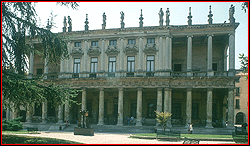
♦Palazzo Barbarano da Porto, Vicenza, 1570-75. The design of the Palazzo Barbarano da Porto was modified during construction after the patron acquired enough adjoining property to make the palace two bays wider on the left side. This meant that the entrance, which had already been constructed, would be off-center. Because this irregularity would have been emphasized by the simplicity of the original design, which has colossal-order columns, a more complex, two-story articulation was adopted. The revised design featured screens of engaged colonnades on both stories. This repetition brought unity to the principal stories, which were distinct from each other in texture, the ground story being rusticated masonry and the piano nobile being smooth plaster. Both stories were ornamented by stucco relief.
♦Palazzo Porto-Breganze, Piazza Castello, Vicenza, 1570s. Only two of the seven bays that had been designed for the Palazzo Porto-Breganze were built. Like several of Palladio's other late works, the Palazzo Porto employs columns of the colossal order.
Example of Scamozzi's Palaces in Vicenza
♦Palazzo Thiene-Bonin, 1572-77? The Palazzo Thiene-Bonin was designed and built by Vincenzo Scamozzi (1552-1616), the leading architect in the Veneto after Palladio's death. Its design is very similar to that of the Palazzo Barbarano by Palladio, who may have had a hand in its design. The repetition of the Corinthian order on both stories, however, is not characteristic of Palladio, who used graduated orders. Repetition of the same order had previously been used by Sanmicheli for the Palazzo Grimani, on which the Corinthian order was used on all three stories.


 Add Placemark
 Go Back


