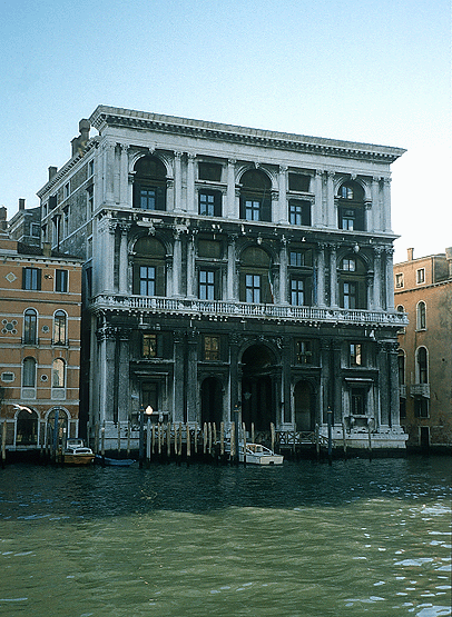
Palazzo Grimani
Venice, begun 1556
Architect: Sanmicheli
BACKGROUND
Commission
In 1556 the Procurator Gerolamo Grimani commissioned Sanmicheli to design the Palazzo Grimani in Venice. It was constructed between 1556 and 1575.
After Sanmicheli's death in 1559, the architect Gian Giacomo de'Grigi was put in change. Under him, several modifications to Sanmicheli's design were made such as reducing the height of the upper two stories.
Site
The site was trapezoidal and the front façade was oblique to its main axis. Although this shape limited the degree of symmetry that could be achieved on the interior, it did not prevent Sansovino from designing a totally symmetrical façade.
Quality
The palace's size and richness of the materials made it comparable to the finest palaces in Venice. In Venetia città nobilissima et singolare (1581), Jacopo Sansovino's son Francesco proclaimed the Palazzo Grimani to be one of the four finest palaces in Venice, the other three being Codussi's Palazzo Vendramin-Calergi and his father's Ca' Dolfin, and Palazzo Corner della Ca' Grande.
USE OF THE ORDERS
Orders on the Ground Story
Instead of using rustication on the ground story, as he had on palaces in Verona, Sanmicheli used the orders.
Columns in Two Forms
The column form varies according to its placement. Pilasters are used on the ground story and the outer corners of the upper stories, and engaged columns are used for the rest of the upper-story columns.
The use of pilasters on the corners to frame lines of engaged columns was derived from the ancient Roman Basilica Julia in Rome. Sanmicheli also used this combination on other buildings such as the Palazzo Pompei.
Dual Scale of the Orders
The façade is articulated as three stories by entablatures carried by giant-order columns and pilasters. Each of these giant stories is sub-divided into a main story and a mezzanine by a smaller system of the orders whose column form is the pilaster.
The combination of giant-order columns or pilasters with smaller pilasters whose entablatures seem to pass behind the larger columns was first used by Alberti at Sant' Andrea in Mantua.
Corinthian Order on All Stories
Instead of superimposing different orders in an upward progression that became more decorative on each level, Sanmicheli used the Corinthian order, the most ornate of the orders, on all three stories.
Although the smaller pilasters are also of the Corinthian order, they differ from the giant-order columns in being unfluted.
COMPOSITION
Three-Part Division of the Façade
Like a number of other Venetian palaces, the Palazzo Grimani is divided into a center and flanking sections, an arrangement that was typical of Venetian Palaces for reasons related to the site.
The separation of the end bays from the center is emphasized by doubled columns and broader expanses of solid wall on each side of the outer windows.
Variation in Window Size and Shape
One of the features that distinguishes the Palazzo Grimani from many Venetian palaces is the variation in shape and width of the upper-story openings.
The upper openings of the central and outer bays are arched, and those in between are rectangular. The use of arched openings contributes to the illusion of three large stories instead of six smaller ones.
Centralization of Middle Three Bays
By combining arched and rectangular openings, the central three bays on each of the levels cohere as separate units.
In having a centralized composition, the Palazzo Grimani's three-bay entrance portal differs from portals composed of three uniform bays such as that designed by Sansovino for the façade of the Palazzo Corner della Ca' Grande or those designed by Giulio Romano for the exterior and courtyard facings of the Palazzo del Tè in Mantua.
Superimposed Triadic Compositions
The use of triadic compositions on all three stories contributes to the centralization of the façade as a whole. Tightening the rhythm of the central bays is one of the features that came to distinguish Baroque façades from those of the Renaissance.
Other buildings that included three-part groupings on all levels are the Palazzo Farnese and the Villa Giulia.
INTERIOR
Layout
Like most Venetian palaces, the Palazzo Grimani is narrow and deep.
On the ground story, a long passage runs from the entrance vestibule to a courtyard in the rear. This hall-like room provides access to outer rooms, staircases, and side entrances.
Vestibule
The vestibule consists of a central tunnel-vaulted passage that is flanked by aisles with flat-ceilings. This combination is also used for the vestibules of the Palazzo Farnese and the Palazzo del Tè.
Integration of Vestibule and Façade
In having a high center aisle flanked by lower side aisles, the vestibule corresponds to the entrance's large central arch flanked by smaller arches.
See visual summary by clicking the Views button below.


 Add Placemark
 Go Back


