Villa Farnesina
Rome, 1506-11
Architect: Peruzzi
BACKGROUND
Commission
The Villa Farnesina in Rome was built for Agostino Chigi, Pope Julius II's banker, who, like Peruzzi, was from Siena.
Site
The villa property was located on the west side of Rome at a point just across the Tiber from the Palazzo Farnese. It was Rome's earliest villa suburbana, a type of villa that was usually near town and possessed little land and no farmland. It served as a place of short-term leisure rather than long-term occupation.
Name
The original name, the "Villa Chigi," was changed to the "Villa Farnesina" after the property was acquired by the Farnese family in 1579. The name's diminutive suffix "ina" was adopted to distinguish it from the Farnese family's larger quarters, the Palazzo Farnese, whose back side faced the Tiber River.
PLAN
U-Shape Plan
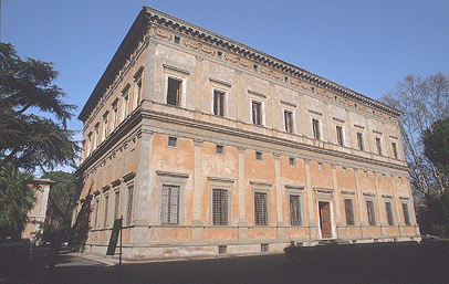
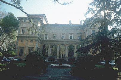
In plan, the Farnesina consists of a rectangular block with square wings that extend outward from adjacent corners, forming a U-shape plan.
U-shape plans gained popularity for villas in the sixteenth century, and Peruzzi's use of this plan was an early instance.
In the sixteenth century, the villa's main entrance was on this facing.
Use of Two Loggias
Ground-story loggias face outward on two facings. The north loggia stands between the wings and the east loggia stands on the side toward the Tiber River.
Convertibility to a Theater
A makeshift, open-air theater could be created on the north side by installing seating on the grounds in front of the wings, building a stage in the space between the two wings, and using the loggia as a scaenae frons (Roman stage building).
Superimposed Pilasters
Superimposed pilasters of the Tuscan order decorate the exterior. The articulation of the façade with superimposed pilasters was a feature that Alberti introduced in Florence at the Rucellai Palace in the middle of the fifteenth century. By the end of the fifteenth century, this feature was used to decorate palaces in Rome.
Painted Plaster
The plaster walls were originally decorated with fresco designs painted in grisaille.
Because of the deterioration of the fresco decoration, the pilaster articulation has a more severe appearance than it would have originally when there was other decoration. Something of the visual effect of fresco on a building exterior can be imagined by viewing the Palazzo Geremia.
Terracotta Frieze
The upper wall below the eaves is decorated by a continuous frieze of molded terracotta relief depicting putti holding festoons, garlands of woven of plant forms.
Windows within the frieze reveal the presence of an attic story.
15TH-CENTURY APPEARANCE
Overview
The Villa Farnesina has a fifteenth-century appearance because it lacks many of the features that became typical of sixteenth-century villas shortly after its construction.
Use of Single rather than Paired Pilasters
Although single pilasters or columns were still used in the sixteenth century, they were more commonly used in pairs like those of the Palazzo della Cancelleria. On later palaces like the Palazzo Farnese, they were not used at all.
Two-Bay Facings
The use of two bays on the ends of the wings, which resulted in columns rather than windows in the center of each wing, testifies to Peruzzi's devotion to the use of modules. In the sixteenth century it was more common to utilize an odd number of bays like one or three, even if it interrupted the continuity.
When dealing with a similar situation later in the sixteenth century at the Loggia del Capitaniato, Palladio included three bays instead of two by making the side bays narrower.
Lack of Plasticity
The exterior lacks plasticity because the flatness of the walls below the cornice is relieved only by features with little projection.
Lack of Circular Features
All the walls are straight, and the villa lacks curved features like exedrae, circular staircases, circular courtyards, and apses. These features began appearing in the work of Bramante and Raphael a few years later. (Circular features continued to be important in villa design as illustrated by Palladio and Vignola.)
FRESCO DECORATION OF INTERIOR
High Quality
The Villa Farnesina is more admired for its interior fresco decoration than for its architectural design. Its frescos were painted by the leading painters of the day: Raphael, Romano, Sebastiano del Piombo, Sodoma, and Peruzzi himself.
Integration with Architecture
Peruzzi's own experience as a painter of interiors aided him in conceiving of this building as an arrangement of spaces and surfaces that would be completed by painting. Such a high degree of integration between architecture and decoration was seldom achieved in the Renaissance, and on some occasions, architects were displeased with the decoration's effect. (Brunelleschi felt that Donatello's brightly colored and vigorously carved relief sculpture in the Old Sacristy detracted from the purity of the architectural forms, and Andrea Palladio is believed to have felt that his own conception of the solids and voids at the Villa Barbaro was violated by Veronese's painted solids and voids.)
Special Rooms
The rooms most admired for their decoration are the two ground-story loggias and the Sala delle Prospettive.
●Loggia di Psiche. The Loggia di Psiche(north loggia) was painted by Raphael and his assistants. The ceiling depicts the story of Cupid and Psyche, who are presented in a bower-like framework of foliage that appears to spring from the real architectural features below. Both fictive and real architectural forms are painted in cool, muted hues. In order to safeguard the frescoes, the open arches have been filled with glass.
●Sala di Galatea. The Sala di Galatea (east loggia) is named for Raphael's famous painting of the Triumph of Galatea. Peruzzi painted the ceiling of this room as a night sky filled with astrological figures and stars in the configuration that existed at the moment of Agostino Chigi's birth.
●Sala delle Prospettive. The Sala delle Prospettive is located above the north loggia. The walls are painted to resemble fictive loggias through which views of Rome can be seen. The illusions are very compelling from the correct viewpoints because of the continuity between the painted and actual architectural features. Furthermore, the views themselves are coordinated in scale and viewpoint to create a coherent and unified outdoor space just beyond the room.
See visual summary by clicking the Views button below.


 Add Placemark
 Go Back


