Library of San Marco
Piazzetta San Marco, Venice, 1537-91
Architect: Jacopo Sansovino
BACKGROUND
Location
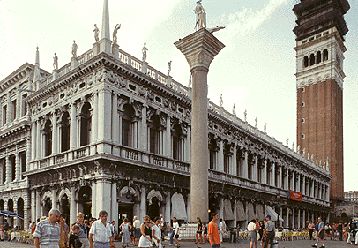
The Library of San Marco in Venice, which was designed by Jacopo Sansovino, occupies a prominent position in the complex of buildings near San Marco and the Doge's Palace. It extends from the Piazza San Marco to the waterfront next to the Zecca (Mint). Its short side faces the jetty and its long side parallels the Doge's Palace, which stands across the Piazzetta (Small Piazza).
This complex of buildings, which has become emblematic of the city, has long been the subject of painters like the eighteenth-century artist Canaletto.
Bessarion Collection
The library was built to house the collection of manuscripts given to the Venetian Republic in 1468 by Cardinal Bessarion, a Greek humanist who immigrated to Venice.
CONSTRUCTION HISTORY
1537: Beginning of construction. Construction was begun at the end facing the campanile.
1545: Collapse of reading room vaults. The vaults of the reading room collapsed, and Sansovino attributed the failure to a severe frost before recent concrete construction had set up. Nevertheless, he was imprisoned until the intercession of his influential friends, the painter Titian, the writer Pietro Aretino, and one of Emperor Charles V's ambassadors. Sansovino was forced to pay for the damage, and roof construction was modified from stone vaulting to timber frame, which was better suited to building on Venice's shifting, silt-based land.
1554: Construction paused after 16th bay. Construction ended in 1554 with the completion of sixteen bays. An inn then occupied the property next to the waterfront, and delays in its demolition temporarily halted progress on the library.
1558: Books installed. The personal Library of Cardinal Bessarion and the collection of manuscripts belonging to the Republic were moved into the new building.
1588-91: Five bays added. Under the direction of Sansovino's pupil Vincenzo Scamozzi (1552-1616), the leading architect in the Veneto after the deaths of Sansovino in 1570 and Andrea Palladio in 1580, five more bays of the same design were added to form a seamless repetition of 21 bays along the long side and three bays on the ends.
BASIC SCHEME
Compatibility with the Doge's Palace
Because the Library was one of two long buildings defining the sides of the Piazzetta, it was important that its design be compatible with the Doge's Palace in both scale and strength.
Although the Library and the Doge's Palace have certain features in common, the Library's classical vocabulary using the orders and arrangement of superimposed orders announce its Renaissance origin.
Although the Library is only two stories high, the density of its ornate masses enables it to visually counterbalance the palace's three stories.
Repetition of Identical Bays
The Library is composed of a series of bays that are identical except for the thickening of the corner piers. Because there is no centrally placed entrance bay, the building can be expanded on either end without disturbing its balance.
Balancing Horizontal and Vertical Lines
The horizontal dominance produced by long runs of balustrade-topped entablatures is counterbalanced by a series of vertical accents formed by obelisks and statues above the superimposed pilasters and engaged columns.
Plasticity
The building has great plasticity due to the massing of architectural components and copious use of sculpture.
●Large arched openings. Large arched openings on both stories create a scheme of solids and voids.
●Projecting features. The use of engaged and freestanding columns instead of only pilasters makes the wall more sculptural.
●Sculpture. Sculpture (discussed later) contributes to the building's plasticity by adding projections to wall surfaces and roof edges.
LOWER STORY
Function
The ground story, which is not part of the Library proper, consists of a tunnel-vaulted loggia in front of a series of commercial stalls.
Today, much of this area is utilized by open-air cafes whose tables flow out into the Piazzetta itself.
Derivation from Ancient Roman Models
The arcade of the lower story is a variant of the type used for long ranges in such ancient Roman buildings as the Theater of Marcellus and the Basilica Julia. The Library resembled these buildings in using superimposed orders on a double story of arcading.
Use of Doric Order
Sansovino selected the Doric order, the severest of the orders and one that Bramante often used.
Use of Half-Metopes on Corners
Vitruvius recommended that the corners of Doric friezes should terminate with half of a metope.
The traditional placement of triglyphs over columns makes a corner placement of the metope impossible.
Sansovino solved this problem by attaching pilasters to piers whose width was greater than that of the other supporting columns. The piers thus supported a triglyph and half-metopes on each facing, allowing the metopes to wrap around the corners of the piers. When seen from an angle, the two halves read as a whole metope.
UPPER STORY
Overview
The second story is like the lower story in being an arcade, but it is different in having smaller arches and an innovative configuration of supports.
Configuration of Supports
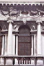
Sansovino's design of the upper-story arcade is innovative in its support of arches by a combination of piers and freestanding columns, which are placed directly under the imposts.
When used with a wider gap between column and pier, as Palladio did a few years later when remodeling Vicenza's Basilica, this configuration is referred to as the Palladian motif. Although this motif had been illustrated in a painting by Raphael years earlier, the Library is considered the earliest building to utilize it.
Large and Small Orders
The upper-story arches are ornamented by columns in two sizes: arch-high and impost-high. The use of the orders in two sizes on a single story has a long history in Renaissance architecture dating back to Brunelleschi's Foundling Hospital.)
The Library's columns follow the same order on each story regardless of their form.
The smaller columns stand two deep and are distinct from the larger ones in being freestanding and fluted rather than engaged and smooth-shafted.
The impost blocks take the form of Ionic entablatures, a device that dates back to Brunelleschi's nave arcade at San Lorenzo in Florence.
Coordination of Frieze and Columns
As on the ground story, where triglyphs are positioned over columns, the pattern of the frieze is coordinated with the columns. Above each engaged column, a putto supports sections of a garland that scallops up to the attic windows, which are positioned over the arches.
SCULPTURAL ENRICHMENT
Palladio's Praise
Palladio praised the Library as "the richest and most ornate building that has been put up, perhaps, since the time of the ancients."
The Library's sculpture is both freestanding and in relief.
Freestanding Sculpture on Roof
The Library was the first Renaissance building to use sculpted figures on the roof edges in the manner of ancient Roman temples.
Rooftop sculpture was not typical of Renaissance architecture, but it was soon to be used in the Veneto by Andrea Palladio, who is known to have admired the Library's richness.
Relief Sculpture
Relief sculpture ornaments the friezes, spandrels, and keystones.
The ground-story frieze is ornamented by an alternation of triglyphs and metopes, as is traditional with the Doric order.
The second-story frieze is carved with a garland held by putti, a subject that was widely used in Rome and other places in the early sixteenth century.
See visual summary by clicking the Views button below.


 Add Placemark
 Go Back


