Public Buildings
CIVIC PALACES
The Term "Palazzo"
Except for special-use buildings like hospitals and libraries, most buildings used for civic and communal purposes were called palaces. The term palazzo refers to a large building that is usually several stories high. Before the Renaissance, the term was generally associated with government buildings, but in the Renaissance it came to include buildings containing upper-class domestic quarters.
Functions
The type of facilities needed for civic palaces varied with the form of government in place. All governments required quarters for court proceedings, record-keeping, tax assessment, minting coins, and a host of other governmental functions. Many of these departments were housed in different buildings.
A city's form of government was reflected by the types of rooms within its main civic palace. Those of cities governed by individuals included domestic quarters, and those cities governed by legislative bodies included assembly rooms.
Adding Façades to Existing Civic Palaces
Because civic palaces expressed the prestige of the state, community, or institution in possession of them, their façades were especially important.
New façades were added to older public buildings for such purposes as modernization, reinforcement, and unification. Michelangelo modernized the medieval Palazzo Senatorio's façade by adding a classical vocabulary and center-focused symmetrical features. Palladio reinforced Vicenza's crumbling basilica by bracing the outer walls with a collar of vaults. Vasari unified the Uffizi by providing a one-bay deep addition with a nearly uniform repetition of three-bay units over much of its expanse.
Use of Loggias
Although loggias, were used on the façades of many types of buildings, they were especially characteristic of civic palaces. In the late medieval period, loggias often occupied the entire ground story of civic palaces in northern cities.
Loggias provided useful extensions to the domains of both buildings and streets. They could be used as waiting areas for those about to enter or as shelters for pedestrians in bad weather. Loggias also provided spaces where public meetings could be held or proclamations could be read.
Examples of Civic Palaces
The examples below of civic architecture in the Renaissance include both newly constructed buildings and older buildings with new façades.
♦Sansovino's La Zecca, Venice, begun 1536. The Zecca, the Venetian Mint, by Jacopo Sansovino, was originally only two-stories high, and in this and several other features, it resembles Bramante's Palazzo Caprini. The heavily rusticated upper stories convey an impression of impregnability. The banded supports on all stories and the use of canopy-like lintels over the second-story windows are among its Mannerist features.
♦Sansovino's Loggetta, Venice, 1538-45. Sansovino's Loggetta, a small assembly hall built for the Venetian nobility, stands at the base of the campanile of San Marco. Its design is partly based on triumphal arches like the Arch of Constantine with which it shares several features despite many differences. The proposed designs for the façade of San Lorenzo in Florence by Sansovino's mentor Giuliano da Sangallo were also a source of inspiration for features such as niches flanked by paired columns. The Loggetta's richly colored marble, highly plastic architectural design, and profusion of sculptural enrichment enable it to assert itself into the Piazzetta San Marco, despite its small size and proximity to buildings that are large and highly ornate.
♦Palladio's Vicenza Basilica, Piazza dei Signori, Vicenza, 1549-1617. At the Palazzo della Ragione, located at the city center of Vicenza and better known as the Basilica, Andrea Palladio designed a two-story outer shell of superimposed arcades to reinforce its weak structure. It is here that the Palladian motif first reached its mature form with a distinct space between column and pier.
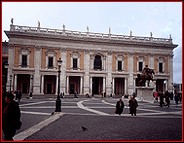
♦Michelangelo's Palazzo Senatorio, Piazza del Campidoglio, Rome, 1544-52 and 1561-1616. In conjunction with beginning the Piazza del Campidoglio, Michelangelo designed a new staircase and façade for the Palazzo Senatorio. His massive staircase and two-story pilasters convey the dignity and stability of Roman civic authority. The addition of a prominent staircase and the rebuilding of an off-center tower in the center gives the building a central focus that is especially appropriate for its central position at the closed end of the piazza.
♦Michelangelo's Palazzo dei Conservatori, Piazza del Campidoglio, Rome, 1563-84. To update the Palazzo dei Conservatori stylistically in conjunction with the building of the Piazza del Campidoglio, Michelangelo designed a new loggia-fronted façade. The loggia was unique in using trabeated construction in place of arcuated construction, which was commonly used for loggias in the Renaissance.
♦Palladio's Loggia del Capitaniato, Vicenza, 1571-72. Andrea Palladio's Loggia del Capitaniato is a three-bay loggia attached to the official residence of the Capitano, the Venetian Captain of Vicenza. Its dramatic use of colossal columns was part of Palladio's late style.
♦Vasari's Palazzo degli Uffizi, Florence, begun 1560. Cosimo I de' Medici commissioned Giorgio Vasari to build the Palazzo degli Uffizi, which would centralize the administration of the government by concentrating all its agencies in one place. It is located off the Piazza della Signoria next to the Loggia dei Lanzi and the Palazzo Vecchio. The Uffizi's U shape is made up of two long parallel wings connected by a short wing that is open all the way through on the ground story. The long horizontal lines are countered by the articulation of the façade into three-bay sections. The end wing incorporates the Palladian motif on two stories. The building's conversion to a museum began in the 1580s when Francesco de' Medici commissioned Bernardo Buontalenti to begin remodeling the top story. In 1737, the Medici family collection of Italian art, which is one of the finest in the world, was given to the state on condition that it remain in Florence.
CITY GATES
Vulnerability
As entrance points into cities, city gates were especially vulnerable, and their security was generally dependent on artillery fire from bastions built within firing range on each side.
Expression of Impregnability
To offset their vulnerability, city gates were designed to express impregnability and power. Bold proportions and heavily rusticated surfaces were often employed to achieve this effect.
Expression of Refinement
City gates also communicated certain cultural values. A report on Venice's fortifications in 1536 criticized their design as being expressive of a government that was authoritarian rather than republican.
As the public faces of cities, city gates were given the same attention as other forms of public architecture, and commissions to design them were generally awarded to the leading architects.
Gates like those designed by Sanmicheli expressed both impregnability and stylistic refinement.
Ancient Models
As with other types of Renaissance buildings, models were sought from ancient counterparts. Notable among the surviving ancient gates are the Etruscan Porta Augusta in Perugia and the Roman Porta Maggiore in Rome.
Examples of City Gates
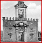
♦Sanmicheli's Porta Nuova, Verona, 1530s. The original appearance of Sanmicheli's Porta Nuova was modified in the nineteenth century when side passages were cut through two blind arches. This gate was the first fortified gate to use rustication and the first to use the full Doric order, features that typify Sanmicheli's military architecture. The use of multiple planes on the Porta Nuova was also typical of his other gates.
♦Sanmicheli's Porta San Zeno, Verona, c. 1540. An appearance of impregnability is communicated by the blockish core of the Porta San Zeno, which is primarily ornamented by quoins comprised of huge blocks at the corners and around the portal.
♦Sanmicheli's Porta Palio, Verona, c. 1542-57. In having a large central arch and smaller flanking arches, Sanmicheli's Porta Palio offers a Renaissance variant of the triumphal-arch form. The façade has three planes that recede as they approach the openings. The projection is lowest on the planes within the arches and highest on the column-and-entablature screen that ornaments the main wall plane.
♦Michelangelo's Porta Pia, Rome, 1561-65. Michelangelo designed the Porta Pia for Pope Pius IV. During the Renaissance, its function as a gate in the city's ancient walls was more decorative than defensive. It stands at one end of a street built by Pius IV, the Via Pia, and faces inward toward the city.
♦Nanni di Baccio Bigio's Porta del Popolo, Rome, rebuilt 1562-65. The Porta del Popolo is located on the north side of Rome beside Santa Maria del Popolo and the Piazza del Popolo. Pope Pius IV commissioned Nanni di Baccio Bigio to rebuild the gate from 1562-65. Its design is similar to that of the Arch of Titus in Rome.
♦Giacomo del Duca's Porta San Giovanni, Rome, 1574. The Porta San Giovanni, which passes through the ancient Roman Aurelian wall, was built by the architect Giacomo del Duca, who had assisted Michelangelo at one time. The use of banded rustication adds texture to the gate's massive, impregnable appearance.
HOSPITALS
Sponsorship
Medieval hospitals, ospedali in Italian, were largely sponsored by monasteries and community organizations such as confraternities and guilds.
Simplification of Plans in Renaissance
Renaissance hospitals were simpler in design than their medieval counterparts, which typically had complex, sprawling plans.
Brunelleschi began the trend toward simplification with his design for the Foundling Hospital in Florence, whose four wings encloses a square courtyard.
Cross-Shaped Plans
The most important line of development in Renaissance hospital design was that of the cross-shaped plan. This popular plan has roots in the men's ward of the medieval Hospital of Santa Maria Nuovo in Florence.
Examples of Hospitals
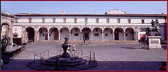
♦Foundling Hospital, Piazza Santissima Annunziata, Florence, 1419-mid 15th century. At the beginning of the Renaissance, Brunelleschi designed much of the Foundling Hospital, whose entrance loggia is famous as the first work of architecture in the new Renaissance style. The hospital's plan consists of four wings around a square courtyard. The orphanage's entrance loggia faces the later-built Piazza Santissima Annunziata, which was unified by the use of loggias that were patterned after it on the buildings standing adjacent and opposite. For the loggia ceiling, Brunelleschi employed sail domes, square variations of hemispherical domes, instead of groin vaults like the ceilings of the courtyard loggia. Brunelleschi's original design was modified by the omission of pilasters on the second story and roundels in the frieze and by the addition of circular plaques in the spandrels, an opening through the left blind arch, and extra bays on the right and left.
♦Ospedale Maggiore, Milan, 1456-65. In preparation for the building of the Ospedale Maggiore, Duke Francesco Sforza sent his architect Filarete to Florence to study the cross-shaped men's ward of the Hospital of Santa Maria Nuovo. Filarete's plan utilized two cross-shaped wards that were separated by a courtyard. The whole complex was contained within a rectangular perimeter.
LIBRARIES
Ancient Precedents
Libraries for scrolls existed in ancient times. Trajan's forum contained two libraries so that Greek and Latin scrolls could be stored separately.
Secularization of Learning
During the Middle Ages, literacy was largely the province of the clergy. The rise of commerce and industry in the Middle Ages increased the need for record keeping. The ensuing increase in literacy, in turn, stimulated a trend towards the secularization of learning and the founding of a number of universities in the thirteenth century.
Increased Need for Libraries
In the Renaissance, the new passion for collecting and studying ancient texts, along with the invention of the printing press, increased the demand for areas in which to store and study manuscripts and codexes (early books). In the Middle Ages, they had been stored in closed cupboards.
Books Chained to Lecterns by Windows
Renaissance libraries followed a pattern begun in the thirteenth century at the Sorbonne in Paris. There, books were chained to lecterns that were placed next to windows along the sides of a long room.
Division into Aisles
The first libraries in Italy to be patterned after the arrangement at the Sorbonne were designed by Michelozzo. In Venice he designed a library for the monastery of San Giorgio Maggiore, and in Florence he designed one for the monastery of San Marco. Michelozzo's basilica-like division of these rooms using a high central aisle and lower side aisles emphasized the distinction between areas for book use versus areas for circulation.
The spatial distinction between the central and side areas was not retained in libraries designed by Michelangelo and Sansovino in the sixteenth century.
Shelves against Walls
At the end of the sixteenth century, a new form was introduced at the Spanish royal palace near Toledo, El Escorial, where books were stored on shelves located along the outer walls. Such libraries could be more unified and spacious. This type was introduced in Italy at the Vatican library.
Examples of Libraries
Although libraries were generally under the aegis of churches and monasteries, their design addresses the same problems as any other library with regard to the provision of space for the safe storage and scholarly use of valuable books.
♦Michelozzo's Library of Monastery of San Marco, Venice, 1433. In 1433 Michelozzo designed a library for the Monastery of San Giorgio Maggiore, the same monastery for which Andrea Palladio designed the Church of San Giorgio Maggiore in the sixteenth century. Michelozzo's patron was Cosimo de' Medici, whom he had accompanied to Venice during the Medici family's first period of exile (1432-34) from Florence. Although the library was destroyed in 1614 when the monastery was enlarged, its design can be visualized from that of Michelozzo's similar library in Florence at the Monastery of San Marco.
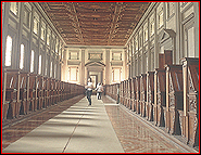
♦Michelozzo's Library of Monastery of San Marco, Florence, 1436-43. The library designed by Michelozzo at San Marco was the monastery's most innovative feature. It became a model for later libraries because of its harmonious blending of classical styling and utilitarian planning. The second-story location provides some safety from floods. Its vaulting and that of the floor below minimizes the danger of fire. Optimum reading conditions are provided by the presence of windows on each side. The interior is divided into three aisles by two colonnades carrying arcades, an arrangement that resembles the interior of a basilica. The central aisle, which is narrowest, is barrel-vaulted, and the outer ones are cross-vaulted. A desk running perpendicular to the aisles stood next to each window.
♦Biblioteca Malatestriana, Cesena, 1452. The Biblioteca Malatestriana in Cesena was founded by Novello Malatesta, who was a cousin of Sigismondo Pandolfo Malatesta. The Library is 130' long and has twenty windows on each side. Its spatial arrangement is like that of Michelozzo's Library of San Marco in Florence.
♦Michelangelo's Laurentian Library, San Lorenzo, Florence, 1523-59. Giulio de' Medici commissioned Michelangelo to design a library for the Medici collection of manuscripts, which he had given to the family church, San Lorenzo. A ground-story vestibule contains stairs leading up to the second-story reading room. The reading room follows the layout used at Michelozzo's library at the Monastery of San Marco in Florence in which lines of crosswise desks are illuminated by windows on the long sides. Michelangelo's Reading Room differs from Michelozzo's library in having a flat ceiling and no internal divisions by supports.
♦Sansovino's Library of San Marco, Piazzetta San Marco, Venice, 1537-91. Jacopo Sansovino's Library of San Marco contains the state's collection of manuscripts, whose nucleus is a large personal collection that was donated in the fifteenth century by Cardinal Bessarion, who fled from Constantinople when it fell in 1453. The library plays an important role in the design of the complex of buildings around the cathedral and ducal palace. Its long side faces a similarly sized wing of the Doge's Palace to form the Piazzetta San Marco. Paintings by Veronese decorate the library's interior. Its reading room follows the pattern of another library in Venice, Michelozzo's library for the Monastery of San Giorgio Maggiore. Although this library was later damaged by fire and torn down during remodeling, it was still intact when Sansovino designed the library at the Piazzetta. The Library of San Marco is significant in being the first instance of adapting Roman architecture to a Venetian building and using the orders correctly. The Library's columns follow the same order on each story regardless of their form. The horizontal dominance produced by long runs of balustrade-topped entablatures is counterbalanced by a series of vertical accents. A novel configuration of supports on the second story contains the roots of the Palladian motif. The impost blocks take the form of Ionic entablatures, a tradition begun by Brunelleschi a century earlier. The Library's sculpture is both freestanding and in relief, and the pattern of the frieze is coordinated with the architectural components.
♦Vatican Library, Rome. Pope Sixtus V (1585-90) commissioned Domenico Fontana to design the Vatican library as a replacement to the smaller library founded by Pope Sixtus IV and located in one of the rooms added to the east side of the old Vatican Palace by Pope Nicholas V. The new library extends across the Belvedere Court, which had only recently been completed. The design of the second story follows the newly introduced library form in which books were stored on shelves located along the outer walls.
THEATERS
Staging Productions of Ancient Plays
The Renaissance interest in all things antique led to the staging of ancient plays by Plautus, Terence, and Seneca as well as contemporary plays by writers who imitated them.
Influence of Ancient Roman Theaters
In seeking models of ancient theaters, Renaissance architects looked to Vitruvius and the architectural remains of ancient Roman theaters.
=Vitruvius. Vitruvius described the features of Roman theaters in his treatise on architecture. Its two main features were an elaborate three-door stage building called the scaenae frons and a semicircular seating area that was uncovered except for a colonnade-supported section of roof along its outer rim. Vitruvius also described the types of settings that were appropriate to tragedies, comedies, and satirical dramas, the three types of Roman plays.
=Ancient Roman Theater Sites. The remains of Roman theaters could be seen at a number of ancient sites. The Theater of Marcellus was especially influential because of its being located in Rome. Distant theaters were recorded by drawings made by architects who traveled.
Theater in the Middle Ages
The theater traditions established by the Greeks and Romans collapsed with the fall of the Roman Empire.
Drama re-emerged in the Middle Ages through ritual dialogues in church services. Church-sponsored plays dramatizing stories from the Bible came to play an important part in educating the illiterate masses about Christianity.
Medieval plays were performed on open stages in public squares or on wagons that visited multiple locations.
Development of Renaissance Theaters
During most of the Renaissance, theaters were erected as temporary structures that were only intended for use for a particular play or ceremony.
The form of theater used in much of the Renaissance was firmly rooted in ancient prototypes. Like their Roman prototypes, Renaissance theaters often had semicircular seating and built-in staging.
The first attempts to re-create Roman-style theaters came soon after descriptions of them were published in Alberti's De re aedificatoria (1485) and Vitruvius' De architectura (1486).
Plays were often staged in the courtyards or reception halls of grand palaces or villas. The teatro da sala, a theater that was part of a larger building, developed from the building of theaters in great halls. Many refinements in staging evolved during this phase of the theater's development.
Renaissance Stage Design
The staging of plays usually involved either a scaenae frons or a perspective stage. These two forms of built-in stage sets, which limited the action to a single setting, were displaced at the end of the Renaissance by lighter, moveable scenery.
●Scaenae frons. The scaenae frons is a Roman stage building, which usually has three or more doorways. In the Renaissance, loggias on exterior facings or large courtyards were sometimes adapted to serve as the scaenae frons, which could be decorated by scenery.
●Perspective stage. The perspective stage included a two-part stage whose front was a platform that extended the width of the theater and whose back part tapered inward. The illusion of a receding street with buildings on each side was created by a series of large right-angle props painted to resemble the corners of buildings. Through the use of linear perspective, the buildings were keyed to a common vanishing point.
Designers of Perspective Sets
Beginning in the late fifteenth century, most of the important artists and architects of the Renaissance, including Leonardo da Vinci, Bramante, and Raphael, were active in staging plays and designing theaters for wealthy patrons.
Of particular importance were Peruzzi, who staged plays in Rome, and Serlio, who studied under him. Peruzzi died in 1537 and bequeathed his drawings to Serlio. Serlio later included many of them in his treatise, which included material on the design of theaters and sets.
●Peruzzi. Peruzzi was a master of the perspective set. His mastery of large-scale perspective illusions is demonstrated by his painting of the Sala delle Prospettive in the Villa Farnesina in Rome. His U-shape façade of the Villa Farnesina included a five-opening loggia that could be used as a scaenae frons when a stage and seating were erected outside. Peruzzi was probably the designer of a wooden theater on the Capitoline Hill with a five-door scaenae frons that was commissioned by Pope Leo X, who wanted it for a ceremony to induct his brother Giuliano de' Medici and his nephew Lorenzo the Younger de' Medici into the Roman patriciate. Peruzzi staged a number of theatrical productions in Rome during his career.
●Serlio. Serlio addressed theater design in a section on perspective in Book II (1545) of his treatise Architettura. Part of his presentation illustrated the use of perspective in staging. Serlio followed Vitruvius in discussing the coordination of sets to drama types. The buildings illustrated for tragic sets were classical and stately, befitting the importance of tragic characters. By contrast, the buildings illustrated for comic sets varied in style as was typical of urban settings. Satirical dramas required rustic buildings in country settings.
Theaters at the Belvedere Court of the Vatican
Semicircular areas of seating were sometimes incorporated into palaces or villas, and by the addition of scenery for particular productions, temporary theaters were formed.
♦Bramante's Circular Staircase Theater. At the Belvedere Court next to the Villa Belvedere, Bramante designed an unusual circular staircase that could be used as a theater. The circular landing functioned as a stage, like the circular performance areas of Greek theaters, and the concave semicircular upper flight of stairs served as seating, like the semicircular seating of Roman theaters.
♦Ligorio's Theater, 1564. Pirro Ligorio designed a Roman-inspired semicircular seating area for the south end of the Belvedere Court. The seating was removed in 1569 by Pope Pius V, who considered provision for entertainment to be inappropriate to the Church’s spiritual mission.
Example of a Permanent Theater
Although make-shift theaters using temporary seating and staging for particular productions continued to be the mode for the rest of the century, permanent theaters were also built from the 1530s. Most of these early theaters, like Buontalenti's theater in the Uffizi, were destroyed. The oldest surviving Renaissance theater and the first ever to be totally enclosed is Andrea Palladio's Teatro Olimpico, which was begun in 1580.
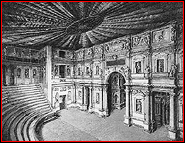
♦Teatro Olimpico, Piazza Matteotti, Vicenza, 1580. Palladio designed the Teatro Olimpico for the Accademia Olimpica in Vicenza. Because of the shallowness of the pre-existing building in which the Teatro Olimpico was built, the stage was relatively narrow and the seating was semi-elliptical instead of semicircular. The niches of the scaenae frons were filled by plaster statues depicting members of the academy. Palladio died soon after the theater had been begun, and it was completed by Scamozzi (1552-1616), his successor as the leading architect in the region. Scamozzi made important changes after additional property was acquired at the stage end. He enlarged the openings of the scaenae frons, a form that had already fallen into disuse in recent theaters, and added inward-tapering hallways that radiated outward behind them. The hallways were painted to resemble views down streets, and each hall had its own vanishing point. This differed fundamentally from Palladio's original intention of creating a unified spatial illusion by keying all of the backdrops behind the openings to a common vanishing point.


 Add Placemark
 Go Back


