Axial Churches
INTRODUCTION
Definition of Axial Church
An axial church is a church whose plan is organized along a longitudinal axis. This plan type is also called longitudinal.
In church architecture, axial churches are distinct as a type from central-plan churches, which are organized radially along a vertical axis.
Predominance of Axial Churches
Despite the inclinations of humanists to build centralized churches as metaphors of God's and the universe's perfection, leaders in the Church preferred axial churches because they facilitated processional services and created a hierarchy of spaces within the church.
Types of Axial Churches
In the Renaissance, there were several variations of axial churches. The principal distinction between them was the presence or absence of side aisles.
●Basilicas. The first churches in the Early Christian period were based on ancient Roman law courts known as basilicas. A distinguishing feature of this form is a high central section between two lower sections.
●Aisleless churches. Aisleless churches are a variant of basilicas. At the end of the Middle Ages, such churches were associated with preaching orders like the Franciscans. Several fifteenth-century Roman churches were aisleless, but in the later sixteenth century, the abandonment of side aisles became widespread because more emphasis was put on the services.
●Nave and chancel composite churches. Naves, either with or without side aisles, were sometimes fused with especially large, centralized chancels that embodied elements of centralized votive churches and echoed ancient Roman mausoleums.
Sources of Influence
The design of axial churches was affected by the same forces that affected Renaissance architecture in general. These included an interest in the Classical past and a desire to imitate aspects of its architecture. To this end, ancient Roman models and literary resources were studied by humanist artists and architects.
As the Renaissance evolved, the course of design was influenced by the contributions of the leading architects themselves. Their buildings served as models, and their treatises provided guidance.
MAIN PARTS OF AXIAL CHURCHES
Nave
Because the nave's function is to accommodate the congregation, it is usually the largest part of a typical axial church. Its proportionate width increased in the sixteenth century when more emphasis was put on the congregation's ability to see and hear the services.
The nave ceilings of Renaissance churches are either vaulted or flat, the latter being attached to the undersides of trusses. Ceilings are supported on the long sides by the nave arcades.
Because the nave is generally taller than flanking aisles or chapels, clerestory windows were generally used.
Side Aisles
Side aisles are long halls on each side of the nave that function, like the nave, as spaces for the laity. Typically, they are separated from the nave by arcades supported by columns or piers. Their ceilings are usually vaulted.
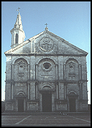
Side aisles are generally lower than the nave except at a type of German church known as a hallenkirk (hall church). The most significant Italian Renaissance church with tall side aisles is Pienza Cathedral. Bernardo Rossellino built this church for Pope Pius II, who wanted to re-create a church similar to one he had seen in Austria.
Chapels along the Perimeter
The need for numerous chapels, which was often satisfied in the Middle Ages by ringing the east end with individual chapels, continued in the Renaissance. After the completion of San Lorenzo, chapels were added beyond the side aisles. At Santo Spirito, chapels beyond the side aisles were planned from the start.
Chapels Substituted for Side Aisles
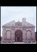
A few churches were built with chapels instead of side aisles on each side of the nave. The substitution of chapels for side aisles has precedents among late-medieval churches of the Franciscan order such as San Francesco at Rimini, known as the Malatesta Temple.
At Santissima Annunziata in Florence, which could not be widened for chapels because it stood next to a street, the side aisles were converted into individual chapels by Michelozzo in the early Renaissance.
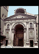
The first Renaissance church to be built with chapels on each side of the nave is Alberti's Sant' Andrea in Mantua. A century later, Vignola designed chapels along each side of the nave of Il Gesù.
Transept
In the Renaissance, axial churches generally incorporated a transept, a form introduced in the Early Christian period. A transept consists of a pair of arms extending laterally from the east end of a church. Renaissance transepts were generally smaller in size than their medieval predecessors. This reduction in size increased both the unity of the interior and the audibility of services in the nave.
Transepts provide space for liturgical uses. Their outer ends, which often terminate in apses, usually contain important chapels.
Besides providing extra space, transepts give axial churches their cruciform or Latin cross shapes, thus adding symbolic value.
Crossing and Dome
In the Renaissance, the crossing created by the intersection of the nave and transept was generally covered by a dome rising from a drum supported on pendentives.
Hemispherical domes, which were based on the round arch used by the ancient Romans, were favored by Renaissance architects. The hemispherical form was well known from the ancient Pantheon, whose giant dome survived intact.
Especially large domes, such as those of Florence Cathedral and St. Peter's, were built steeper than hemispherical because greater verticality decreases the outward thrust. Double-shell construction and interlocking courses were used by both Brunelleschi's and Michelangelo's domes. This latter feature made centering unnecessary.
Chancel
The chancel is the part of the church containing the altar. It is located in the east end between the crossing and the choir.
A chancel screen, also called a rood screen, was generally located between the chancel and the nave. Because it blocked the laity's view of the altar, chancel screens were no longer used after the middle of the sixteenth century, when the church provided guidelines concerning the visibility of the altar from the nave.
Choir
The choir is the portion of the church that is occupied by the clergy. It is generally located between the crossing and the apse.
Renaissance choirs varied in proportionate size according to the church's individual liturgical needs. In Venice, for instance, churches that the doge visited regularly needed especially large choirs to accommodate the choirs of both the doge and the home church.
Apse
In reference to churches, the term apse, which refers to a semicircular recess vaulted by a semidome, generally refers to the recess at the church's east end, even when its shape is not semicircular.
Smaller apses were also often used in the form of apsidal niches.
ORIENTATION
Apse toward the East
Christian basilicas were generally oriented so that the apse, where the altar was located, faced east. Although in ancient cultures there was a predilection for praying while facing eastward, the direction of the rising sun, the reason why Christians focused on the east was related to their beliefs about creation. According to ancient sources, the Garden of Eden, the birth place of man, was located in the east, and when God expelled Adam and Eve from the garden, he sent them to live in the west, away from himself and paradise. Consequently, in praying toward the east, worshippers were looking toward God and their ancient homeland.
Apse toward the West in Fourth Century
The churches founded by Constantine after he legalized Christianity in the fourth century did not have east-facing apse ends. Among the churches he founded with west-facing apses are Old St. Peter's, St. Paul Outside the Walls, St. Lawrence Outside the Walls, and St. John Lateran. It is unclear exactly why these Early Christian churches were constructed with apses facing west. It has been suggested that it may be so that the bishop within the apse would be facing east when celebrating the Mass, which he performed while facing worshippers in the nave.
Factors Compromising Orientation
The pre-existing urban fabric of streets and buildings has determined the orientation of many churches.
The Term "East End"
The designations of "east end" and "west end" are commonly used to refer to the apse and entrance ends regardless of their actual orientation.
FAÇADES
The Façade Problem of Basilicas
The façades of basilicas posed a difficult design problem because of the two roof levels that resulted from having a high nave flanked by lower side aisles. Axial churches that lacked side aisles, such as San Pietro in Montorio, did not pose this difficulty.
Incorporating the Temple-Front Motif
Because ancient temples were the religious equivalents of contemporary churches, Renaissance architects found them to be a natural choice for use as models for church façades. Both Alberti and Palladio referred to churches as "temples" in their treatises.
Three Main Façade Solutions
All three of the main solutions to the problem of designing a classical façade for a basilican church included some form of the temple front. Alberti and Palladio were the most important designers of church façades in the Renaissance.
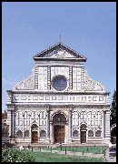
1)Scrolls flanking upper-story temple front. At Santa Maria Novella, Alberti used a temple front on the upper story and hid the slanted side-aisle roofs behind graceful scrolls that extended outward from its sides. Variations on this can be seen on fifteenth-century Roman churches such as Santa Maria del Popolo and Sant'Agostino, and on sixteenth-century churches such as Giulio Romano's S. Benedetto Po in Mantua and Giacomo della Porta's Il Gesù in Rome.
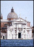
2)Two interlocking temple fronts. For the façades of San Giorgio Maggiore (1566) and Il Redentore (1576), Palladio combined two temple fronts: a narrow, building-high temple front covering the nave and a short, building-wide temple front covering the side aisles. This solution was repeated on other late Renaissance basilican façades such as the Cathedral at Urbino. The separate elements of Palladio's design, including the giant-order temple front and the lower and wider split-pediment, have precedents in Alberti's work. He designed a giant-order temple front for Sant' Andrea and a split pediment of segmental contour for the Malatesta Temple. The latter is echoed at San Zaccaria in Venice, designed by Alberti's follower Mauro Codussi.
3)Non-basilican façade shape. Another approach to the shape problem was to side-step it. At Sant' Andrea, Alberti did not design a façade for the whole church, but instead, he added a vestibule whose shape was well suited to being detailed as a colossal-order temple front with a secondary order on the lower level. In adding a classically shaped vestibule, Alberti may have had the Pantheon in mind. Another means of avoiding using a dual-level roof is illustrated by Michelangelo's proposed façade of San Lorenzo in Florence, which is essentially a rectangular screen that hides the church's irregular shape from the front.
BRUNELLESCHI'S AXIAL CHURCHES
Stylistic Influences on Brunelleschi
Brunelleschi's work shows the influence of both Roman architecture, which he is believed to have studied in Rome before beginning his architectural career in Florence around 1418, and Tuscan Romanesque architecture, which was then believed to be older and more closely related to Roman and Early Christian architecture than it actually was.
Examples
Brunelleschi's ecclesiastic structures in Florence include two centralized chapels, two major basilicas, one centralized church that was not completed, and the largest dome since the ancient Pantheon.
♦San Lorenzo, Florence, 1421-1470s. The rebuilding of San Lorenzo afforded Brunelleschi the opportunity to apply a modular approach to the plan and vertical proportions of an axial church. In its basic scheme of columns separating side aisles from a nave whose ceiling is flat, San Lorenzo resembles both ancient Roman and Early Christian basilicas. After Brunelleschi's death, San Lorenzo was expanded by the addition of individual chapels beyond the side aisles.
♦Santo Spirito, designed by 1434, foundation stone laid 1436, finished 1482. The most complete representation of Brunelleschi's late style is Santo Spirito, which embodies a more Roman approach to form and mass. It is similar to San Lorenzo in its use of a modular plan but different in having a perfect Latin-cross shape and a continuous aisle of connecting bays around the perimeter. Apsidal chapels, which were planned from the start, are located along the sides.
ALBERTI'S AXIAL CHURCHES
Theoretical Ideas on Church Design
Although the example of Alberti's churches had some influence on other architects, his primary influence on church design sprang from his architectural theories, which were expressed in his treatise De re aedificatoria.
By discussing churches under the category of "Temples," he linked them with the sacred buildings of the Classical past.
Alberti made a number of general recommendations that applied to both centralized and axial churches. On a theoretical level, he called for churches to embody beauty. On a formal level, he described a number of desirable features.
Approaches to Church Façades
The façades of the Malatesta Temple (c. 1450) and Santa Maria Novella (c. 1458) address the problem of how to create a classical façade for a basilica with a nave of greater height than its flanking side aisles or chapels. The façade of Sant' Andrea is an entrance vestibule that does not cover the rest of the church or reflect its shape.
Many of the features first employed by Alberti were repeated elsewhere over the centuries.
●Two-tiered design. The façade of the Malatesta Temple is articulated as two stories.
●Attic between stories. On the façade of his next church, Santa Maria Novella, Alberti used an attic to minimize the lack of continuity between the upper and lower systems of ornamentation. The discontinuity between these two stories is a result of pre-existing features on the lower story.
●Temple front. Fully formed temple fronts are used at Santa Maria Novella and Sant' Andrea, and a partially formed one is suggested by the outer sections of a segmental pediment shown on a metal illustrating the Malatesta Temple.
●Scrolls over side-aisle roofs. At Santa Maria Novella, Alberti used scrolls to trim the sections of roof over the side aisles. This device was copied in the fifteenth and sixteenth centuries.
●Triumphal arch. Alberti integrated aspects of the triumphal arch into his church façades. Triumphal arches can be seen on all three of his basilica façades: the Malatesta Temple, Santa Maria Novella, and Sant' Andrea.
●Colossal order. At Sant' Andrea, Alberti introduced the colossal order, a two-story high form of the orders that co-existed with a secondary, one-story order.
Examples of Alberti's Axial Churches
The three axial-church façades designed by Alberti occupy an important place in the history of basilican façade design because they were the first in Italy to include the orders. Alberti had been involved with the design of four different churches.
♦Malatesta Temple, Rimini, begun c. 1450. Alberti enlarged the medieval church of San Francesco in Rimini, which is popularly known as the Tempio Malatestiano, meaning the Malatesta Temple. His transformational scheme was not completed, but much of its original design is known from a medal illustrating a dome as wide as the rest of the church. The completed work consists of an outer shell that remains unfinished on the upper story of the façade. The Malatesta Temple is the first church in the Renaissance to incorporate the orders on its façade. Alberti used superimposed orders on the high central section of the façade. The façade's lower story was based on the Roman triumphal-arch form, and its side walls are formed of massive arcades like those of Roman structures such as the Basilica Julia.
♦Santa Maria Novella, Florence, begun c. 1458. The presence of pre-existing features on the lower portion of Santa Maria Novella restricted Alberti's ability to give it a purely classical façade. To maintain continuity with the old part, Alberti covered the new addition with more patterned marble. He called attention away from this anachronistic treatment by imposing a classical framework using a temple front on the upper level and suggesting a triumphal arch on the lower. Because of the proximity of the side portals to the nave arcade, it was impossible to use engaged columns under the outer pilasters of the upper story. Several features of the church's design show the influence of Tuscan-Romanesque architecture. The use of scrolls to cover the outer edges of the side-aisle roofs was repeated by later churches such as Sant'Agostino (1479-83) and Il Gesù (1568-84). A scheme of simple proportions unifies the façade into a harmonious whole.
♦Sant' Andrea, Mantua, 1470. Sant' Andrea is especially important for its use of chapels instead of side aisles to flank the nave, piers instead of columns to support the nave arcade, and barrel vaults instead of flat ceilings for the nave and choir. The façade, which is lower and narrower than the body of the church, functions as an entrance vestibule. Its design fuses a triumphal arch with a temple front and includes a second system of the orders. The façade and nave arcade correspond to each other in the sizes and shapes of their openings, the division of the vertical expanse into three levels, and the right-angle piercing of the large vault by the small one.
15TH-CENTURY ROMAN CHURCHES
Political Background and Papal Initiative
Because the Papacy's absence from Rome during the Great Schism left the city without a strong central authority, a state of lawlessness and vulnerability to foreign domination existed at the time of the restoration of the papacy in 1417.
Papal initiative was critical to church building activity in the city of Rome. Martin V, the first pope after the restoration, began making repairs to the buildings of the Vatican and to many older churches.
The pope who had the greatest influence on the development of fifteenth-century church architecture in Rome is Pope Sixtus IV. He initiated the building of Santa Maria del Popolo, Santa Maria della Pace, San Pietro in Montorio, and the Sistine Chapel.
Architects Working in Rome
Unlike Florence, Rome lacked any native architects of great distinction, and the most important architects working in Rome came from elsewhere.
The architects of many churches have not been conclusively established.
●Leon Battista Alberti. Although no single building in Rome can be positively attributed to him, Alberti was extremely influential there. He was born in Genoa and worked as an architect in several Italian cities.
●Bernardo Rossellino. Bernardo Rossellino of Florence worked on enlarging St. Peter's and renovating San Stefano Rotondo, a centralized church dating to the Early Christian period.
●Baccio Pontelli. Baccio Pontelli, who was born in Florence, began working in Rome in 1481 after having worked in Urbino, where he had been acquainted with Luciano Laurana and Francesco di Giorgio. Baccio is generally thought to have been the architect of Santa Maria della Pace and San Pietro in Montorio.
Characteristic Features of Roman Façades
Roman churches show the influence of ancient Roman architecture, which was most readily studied in Rome because of the presence of Roman buildings and ruins, which were eagerly studied by many fifteenth-century architects. Most important of these was Alberti, whose treatise was circulated among his circle in manuscript form before its publication in 1485.
Alberti's design for the façade of Santa Maria Novella was especially influential, which is reflected by the presence of several common features of the façades of Roman churches.
●Temple front on upper nave. Nave gables are detailed as pediments on columns.
●Columns and entablature on ground story. The ground stories of façades are defined by columns carrying entablatures that expand into truncated pediments when side aisles are present.
●Elevation by platform bases. Like Roman temples and other official buildings, ground stories are elevated by platform bases, which require wide flights of steps for frontal access.
●Classical moldings trimming openings. Openings such as doors and windows are trimmed by classical moldings. Pediments or lintels supported by consoles decorate their tops.
●Classical motifs trimming sloping roofs of gables. The sloping roofs over side aisles are detailed by devices such as festoons of bay leaves (Santa Maria del Popolo) or giant consoles trimmed by anthemia and rosettes (Sant'Agostino).
Characteristic Features of Roman Plans
The plans and interiors of Roman churches have several common features.
●Groin vaulting over naves. Groin vaults instead of trusses were used for the nave ceilings of Roman churches.
●Piers supporting vaults. Piers rather than columns support the vaulting. Pilasters or engaged columns generally embellish the piers. Freestanding supports were not employed at smaller churches such as Santa Maria della Pace.
●Less emphasis on transepts. The transepts of Roman churches are less emphatic, and many churches did not have them.
●Individual chapels on sides. Individual chapels are located on each side of the nave, or if side aisles are present, on each side of them.
●Domes over crossings. Domes usually span the crossing.
EXAMPLES OF ROMAN CHURCHES
♦Santa Maria del Popolo, Rome, begun 1472. Pope Sixtus IV sponsored the building of Santa Maria del Popolo on the site of an older church. The pope encouraged a number of cardinals and wealthy supporters to sponsor individual chapels. Several chapels and tombs belonged to the pope's della Rovere relatives.
Expansion, Decoration, and Tombs
♦Sistine Chapel, Vatican, Rome, 1473-81. The Sistine Chapel was commissioned by Pope Sixtus IV, for whom it was named. It stands between St. Peter's and the rest of the Vatican Palace. Because it was designed to satisfy particular liturgical requirements of the Vatican, it consists of a single large space without subdivision by supports. Its plain, fortified exterior bears no resemblance to a church.
♦Santa Maria della Pace, Rome, 1478-83. The Church of Santa Maria della Pace was commissioned by Pope Sixtus IV as a votive church on the site of a chapel containing a painting that was considered miraculous because its image of the Virgin Mary was reported to have bled after being stabbed with a knife. On seeing the painting, the pope vowed he would build a church here as an expression of gratitude for the Virgin's help in ending a war (pace means "peace") with Florence. The monastery of Santa Maria della Pace is best known for two later additions: a cloister Bramante designed in 1500 and a façade Pietro da Cortona began in 1656.
♦Sant'Agostino, Rome, 1479-83. Sant'Agostino, which is attributed to Jacopo da Pietrasanta, was commissioned by Cardinal d'Estouteville of France. It is named for Saint Augustine because it contains relics from the tomb of his mother, St. Monica. Sant'Agostino's interior includes a blending of features inspired by ancient Roman buildings and ruins, traditional medieval construction, and contemporary Florentine buildings.
♦San Pietro in Montorio, Rome, 1480-1500. San Pietro in Montorio was commissioned to replace an order church on land that Pope Sixtus IV ceded to a Spanish order for a monastery. The lofty site on the Hill of Janus, the Janiculum, includes the place where St. Peter was believed to have been crucified. This site is marked by Bramante's Tempietto, one of the most universally acclaimed buildings of the Italian Renaissance.
Plan of San Pietro in Montorio
Exterior of San Pietro in Montorio
COUNTER-REFORMATION CHURCHES
Background
To counteract the loss of power and prestige that resulted from the Reformation, the Roman Catholic Church undertook a series of counteractive measures during the middle of the sixteenth century.
Founding of Reforming Orders
The founding of new reform-oriented orders increased the demand for ecclesiastic architecture. Best known of these was the Jesuit order, which was dedicated to church reform, education, and the conversion of non-Christians. They established Christian missions and built churches in many parts of the world.
Changes in Church Services
More emphasis was put on church services.
●Sermons. Sermons became a tool by which worshippers could be persuaded to repent and accept Christ as their Savior. Before the Reformation, sermons were only delivered on special occasions like Advent and Lent.
●Masses. The Mass, the ritual of the Eucharist, was performed regularly. Before the Reformation, Mass was seldom celebrated.
●Processions. Processions in which a crucifix, a saint's image, or a sacred relic was carried through the church, became more common.
Architectural Changes Affecting Perception
Although no regulations were set forth, a series of general recommendations by the Council of Trent affected church design. In general, these recommendations were aimed at maximizing the effectiveness of the rituals and sermons by providing both a clear view of the altar and acoustical conditions that made the services audible to all.
●Creation of wide, hall-like nave. The nave was made proportionately wider and shorter so that people at the back would be able to see and hear the services at the altar. The use of piers instead of columns made the nave supports more like a wall than a screen.
●Elimination of features in front of the altar. To provide a clear view of the altar from the nave, the rood screen was eliminated. This screen traditionally stood between the nave and choir and separated the laity (body of lay worshipers) from the clergy (body of persons ordained by the Church). Similarly, monuments like large tombs were no longer located in front of the altar.
●Elimination of side aisles. The side aisles were eliminated because from within them the view of the altar was partially blocked by supports, and the sound of the services was diminished by the lower ceilings.
●Presence of side chapels. The presence of chapels on each side of the nave in place of side aisles made it possible to enact Mass at more than one place at a time. Because the chapels were separated from each other by side walls, unwanted sounds were less likely to be heard in other parts of the church, especially if low saucer domes were used.
●Use of austere decoration. Distracting decorations like frescoes and richly colored marble were eliminated in favor of an austere surface finish like whitewashed walls and neutral-colored stone supporting and trimming members. The enhancement of the unity of the interior so that features did not stand out individually also helped focus the worshiper's attention on the altar and services. Most austere church interiors were later sheathed in richly colored marble or painted with lavish designs.
Example in Rome
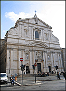
♦Vignola's/Giacomo della Porta's Il Gesù, 1568-84. Main church. Il Gesù, which was the home church of the Jesuit order, was part of a monastery in Rome. Vignola designed its main body, which included many features that were intended to reflect the Council of Trent's recommendations to enhance the congregation's perception of the services. The church is similar to Alberti's Sant' Andrea in having chapels instead of aisles along the sides and using a barrel-vaulted ceiling over the nave. Short transepts made the overall shape rectangular. As the home church of the Jesuit Order, its plan was widely used for Jesuit churches around the world.
Façade. The façade of Il Gesù is largely the work of Giacomo della Porta. A façade by Vignola was rejected by the patron, Alessandro Farnese, in favor of one by della Porta that was based on Vignola's design. Both designs follow a type that was first used by Alberti at Santa Maria Novella in which the orders are presented on two stories separated by an attic, a pediment crowns the top, and scrolls detail the height drops of the side roofs. Della Porta accentuated the portal by doubling its pediments and upright members to create a rhythmic reverberation.
PALLADIO'S AXIAL CHURCHES
Interlocking Temple-Front Façades
In designing axial-church façades, Andrea Palladio employed temple fronts in two different sizes: a pediment on giant-order pilasters marks the nave, and pediment ends on a single-story order correspond to the side aisles.
Palladio designed a variation of this arrangement for the façades of all three of his axial churches: San Francesco della Vigna (1562), San Giorgio Maggiore (1566), and Il Redentore (1576).
Unusually Large Choirs
The plans of San Giorgio Maggiore and Il Redentore both have unusually large choirs because of the need to provide a space for two choirs: one for the monks of the home church and one for the choir of San Marco, which accompanied the doge when he visited on ceremonial occasions. Column screens separate the choirs from the chancels in both churches.
Compliance with Council of Trent Guidelines
Palladio's complied with the recommendations of the Council of Trent in designing San Giorgio Maggiore and Il Redentore. Both churches have vaulted naves carried on piers that are articulated by engaged columns of the giant order and pilasters of a secondary order. Walls are whitewashed, and the orders are constructed of neutral-colored stone. No ornament, aside from the trim itself, is present to distract worshippers from the services. The new guidelines from the Council of Trent are reflected at Palladio's churches by a number of features.
Examples
♦San Giorgio Maggiore, Venice, begun 1566. San Giorgio Maggiore is a large monastery church that can be seen across the lagoon. Palladio solved the long-standing problem of accommodating the differing heights of the nave and side aisles of the basilica by interlacing two temple fronts that differ in size, order, and form of column. A repetition of similar features contributes to its unity. The interior of San Giorgio Maggiore corresponds to the façade in using columns in two orders and sizes: Composite-order columns for the larger order and Corinthian-order columns for the smaller one. The colossal columns of the interior differ in form from those of the façade because they are treated as pilasters as well as engaged units. Several features of San Giorgio Maggiore's plan accommodates its being part of a monastic complex and needing a distinguished visitors area for the Doge and other state officials. The Council of Trent's recommendations that worshippers be able to see and hear the services from the nave were reflected by several features of the church's design. Among these is a screen of columns and arches that separates the chancel containing the altar from the monks' choir at the far end, making it less obtrusive.
♦Il Redentore, Venice, begun 1576.
Façade. The façade of Il Redentore, like that of San Giorgio Maggiore, uses temple fronts of different sizes that reflect the basilica's change in roof levels from the nave to the side chapels. The façade of Il Redentore is more compact because screens shield the side chapels' lower height from the front. Along the nave's clerestory, a series of fin-like screens project laterally between the windows like a series of buttresses. An attic story rising behind the central pediment recalls a similarly placed attic on the Pantheon. There is no correspondence between column form and order on the façade as there is on San Giorgio Maggiore, and both engaged columns and pilasters are used on Il Redentore for both the colossal order and the smaller order.
Plan. The church's plan reflects its three different functions. Il Redentore was conceived in the wake of an especially bad plague as a votive church dedicated to Christ the Redeemer (Redentore). The church also had to accommodate a procession during the annual Feast of the Redeemer and to serve the needs of the monastery that had furnished its site. The use of a centralized plan, which was commonly adopted for votive churches, was precluded by the presence of two features: a nave through which the procession could pass and a monks' choir in which the monks could participate without obstructing a view of the high altar from the nave. Palladio, who had favored a centralized design, gave the rotunda a centralized effect by creating a tri-lobed central zone using apsidal transept arms and a semicircular colonnade screening the monks' choir. The large arch between the rotunda and the nave repeats the semicircle vertically, and its blocking a full view of the rotunda makes the crossing seem wider than the nave. As at San Giorgio Maggiore, optimum conditions for hearing and seeing the services are provided by a barrel-vaulted nave pierced by thermal windows.
OTHER AXIAL CHURCHES
Church-Building Activity
During the fifteenth century, a number of axial churches were built or remodeled, and by the sixteenth century, medieval churches appeared out of date in many cities.
Examples
Axial churches varied widely in design.
♦Rossellino's Pienza Cathedral, Pienza, 1459-62. Bernardo Rossellino's Pienza Cathedral is unusual in its styling because the pope specified that it be based on a Gothic church he had particularly admired when traveling in Austria. Although some of the façade's individual members are classical, their arrangement is not. On the inside, the rib vaulting, the pointed arches, and the clustered columns of the piers proclaimed its Gothic origin.
♦Francesco di Giorgio's Santa Maria delle Grazie al Calcinaio, Cortona, begun c. 1484. Both centralized and axial features are fused by Francesco di Giorgio's cruciform church, Santa Maria del Calcinaio.
♦Michelangelo's Proposed Façade for San Lorenzo, Florence, 1517. Michelangelo's proposed church façade for San Lorenzo followed Santa Maria Novella in having superimposed orders, but it varied from it and most basilica façades in hiding the slanted roofs of the side aisles behind a screen whose outer corners have been squared up to form a silhouette that was essentially rectangular.
♦Giulio Romano's S. Benedetto Po, Mantua, 1540s. Giulio Romano's most innovative contributions at S. Benedetto Po in Mantua concerned the patterns and rhythms of its exterior surface. The articulation of the walls by wide and narrow bays, a feature that Romano had already incorporated at the Palazzo del Tè, recalls the travata ritmica developed by Bramante at the upper terrace of the Belvedere Court. The façade is organized like that of Santa Maria Novella, which also incorporates an attic between the narrow upper story and the wide lower story. Giulio made a couple changes such as using a scroll-edged gable instead of a pediment to crown the upper section and using curved screens similar to those on the façade of Santa Maria del Popolo in place of scrolls to bridge the gap between the high center and lower sides. The curves of these devices echo those of the gable at the top.
Selected Axial-Plan Church Façades
See Axial-Plan Church Interiors
|


 Add Placemark
 Go Back


